


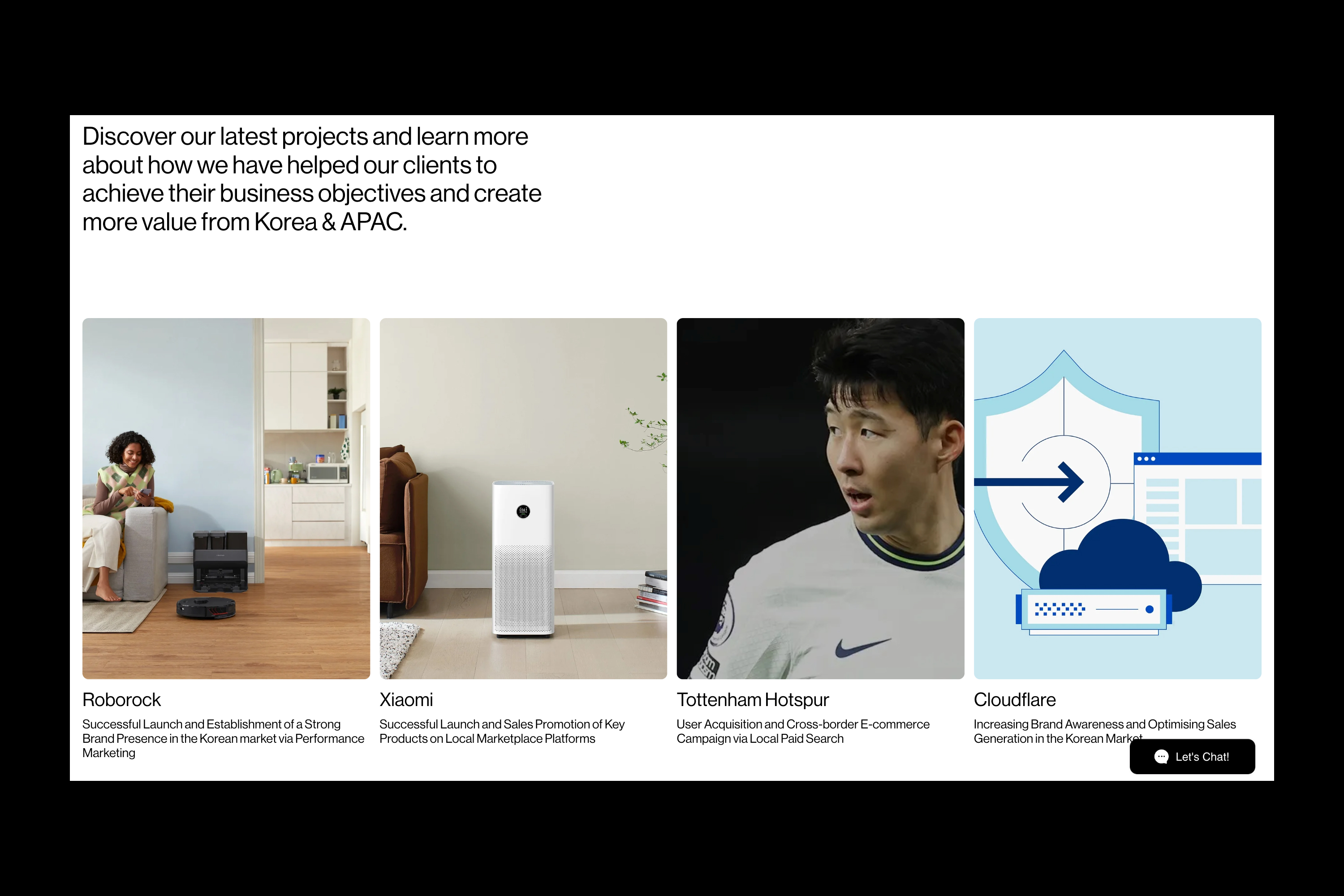
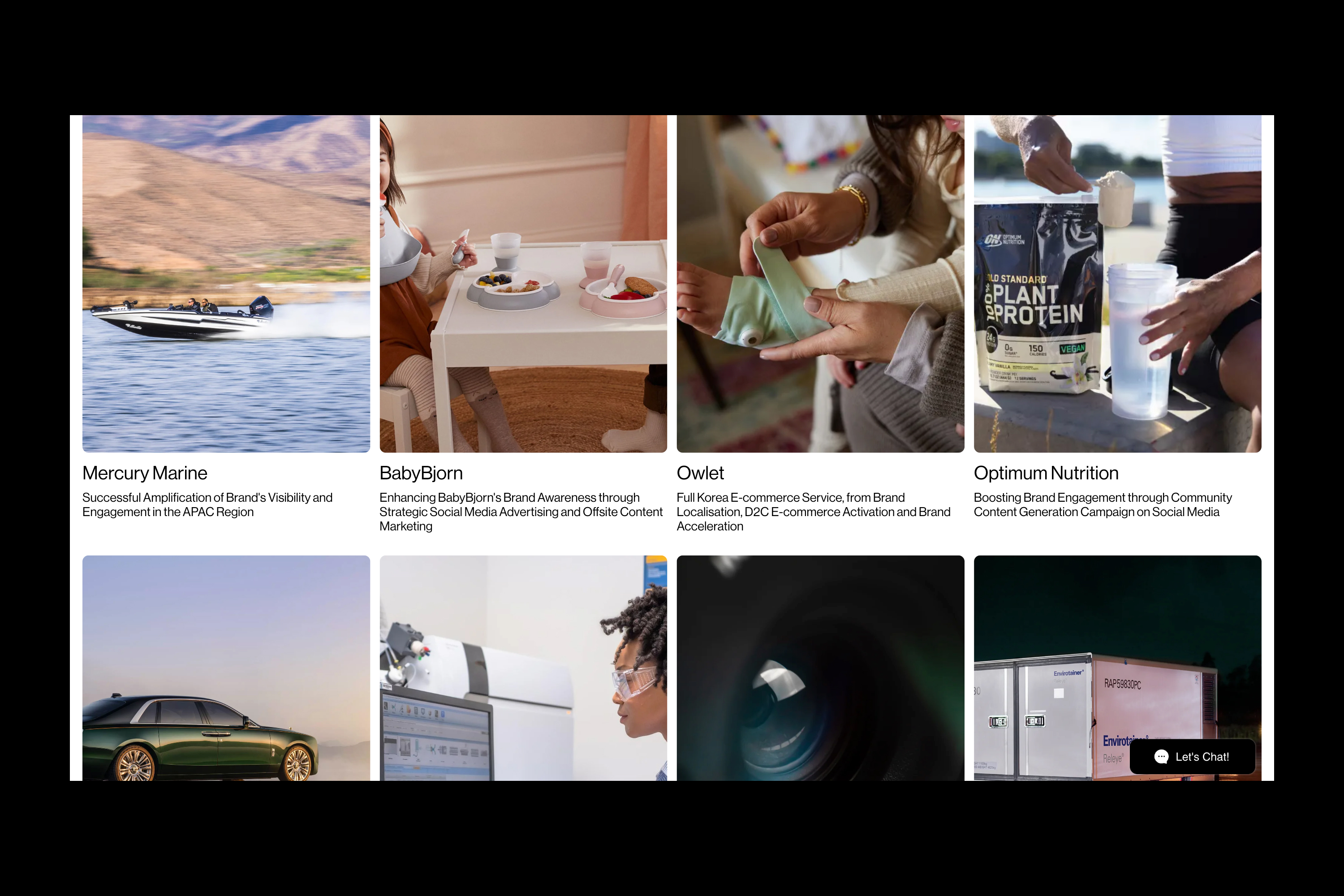
#1 – Thirty in 2 Hours 28 Minutes
April, 2025 – Focus Flow
Apple Music, Spotify, Categories : Illustration
April, 2025 – Focus Flow
Apple Music, Spotify, Categories : Illustration
LDN 2025 Agency Book, 2025, 2025, Categories : Printed Matter, Editorial Design
DMA 2024 Borochure Experiment, 2024, Categories : Graphic Identity, Printed Matter


Poster for Exhibition “Recomposition”, the alphabet was recomposed to create a recomposition.
Recomposition, 2024, Categories : Graphic Identity, Poster
Recomposition, 2024, Categories : Graphic Identity, Poster
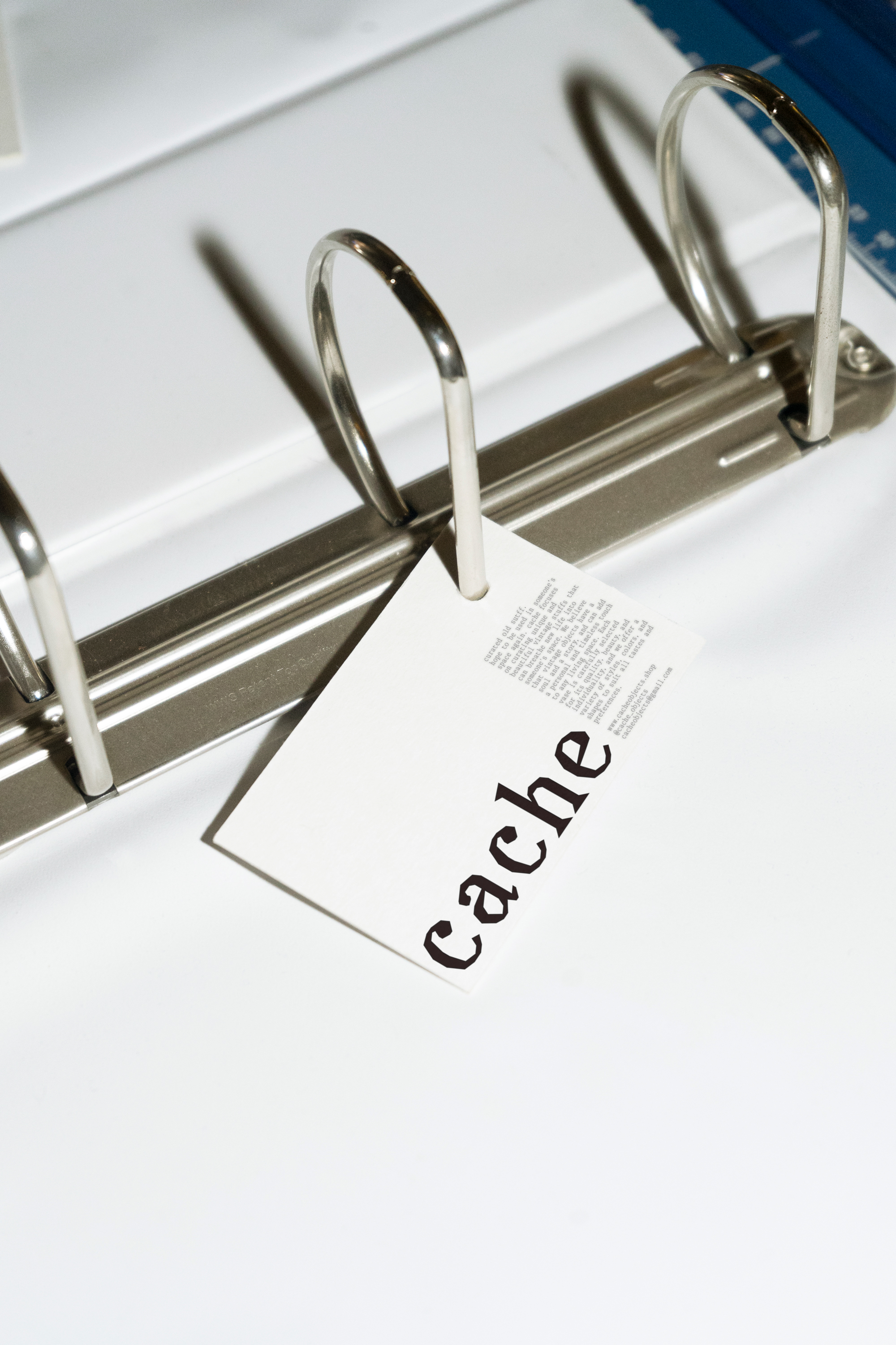
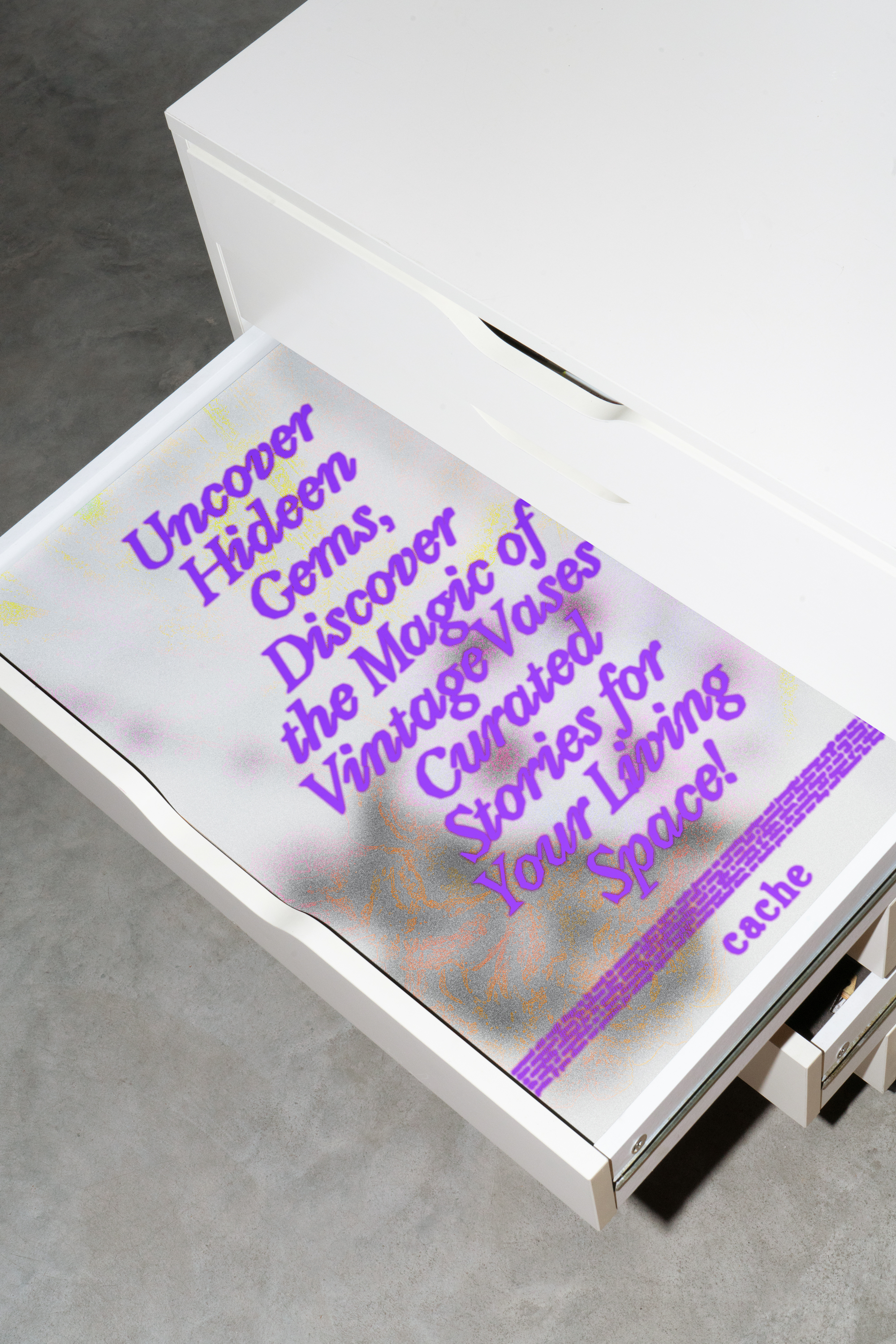
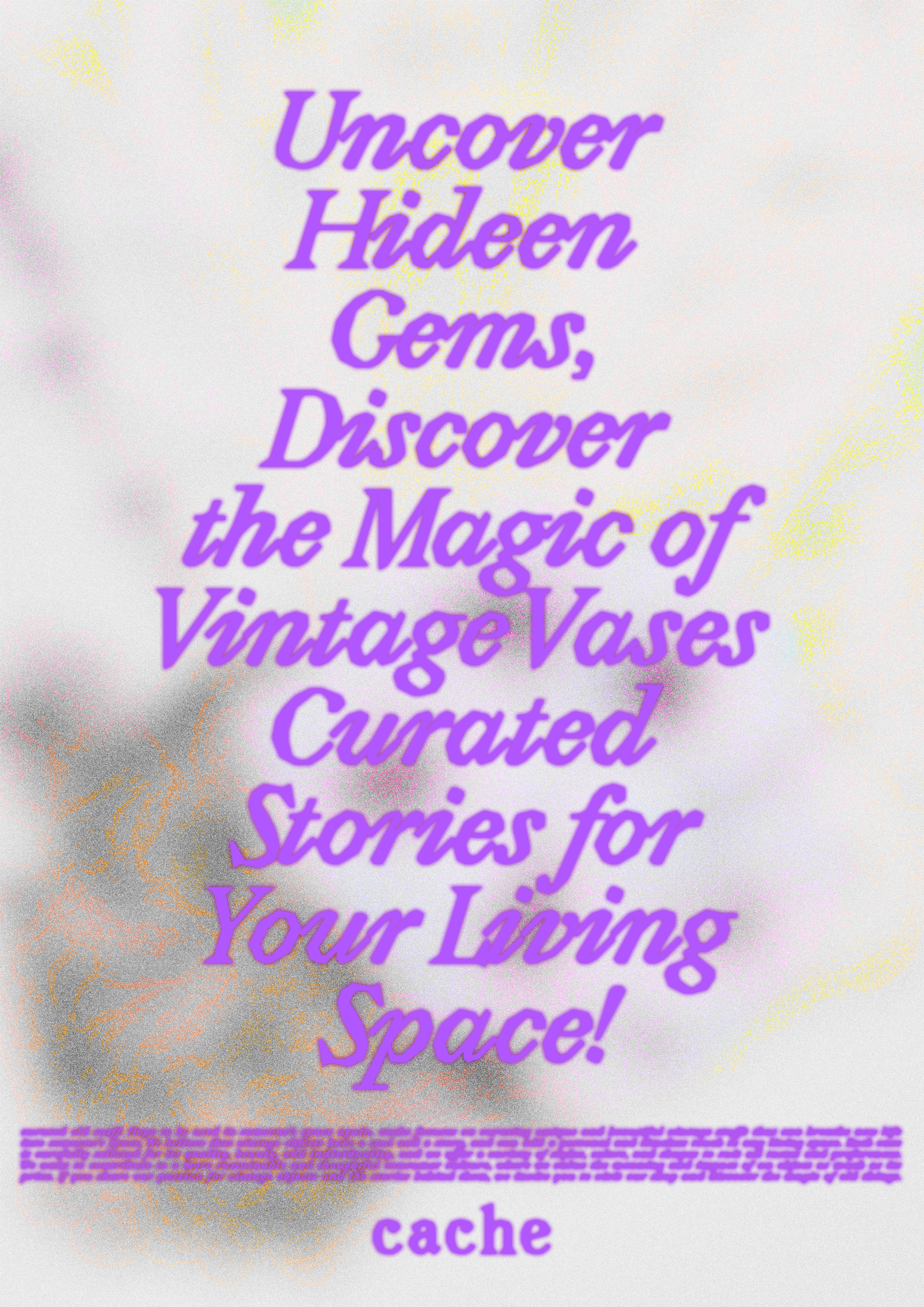
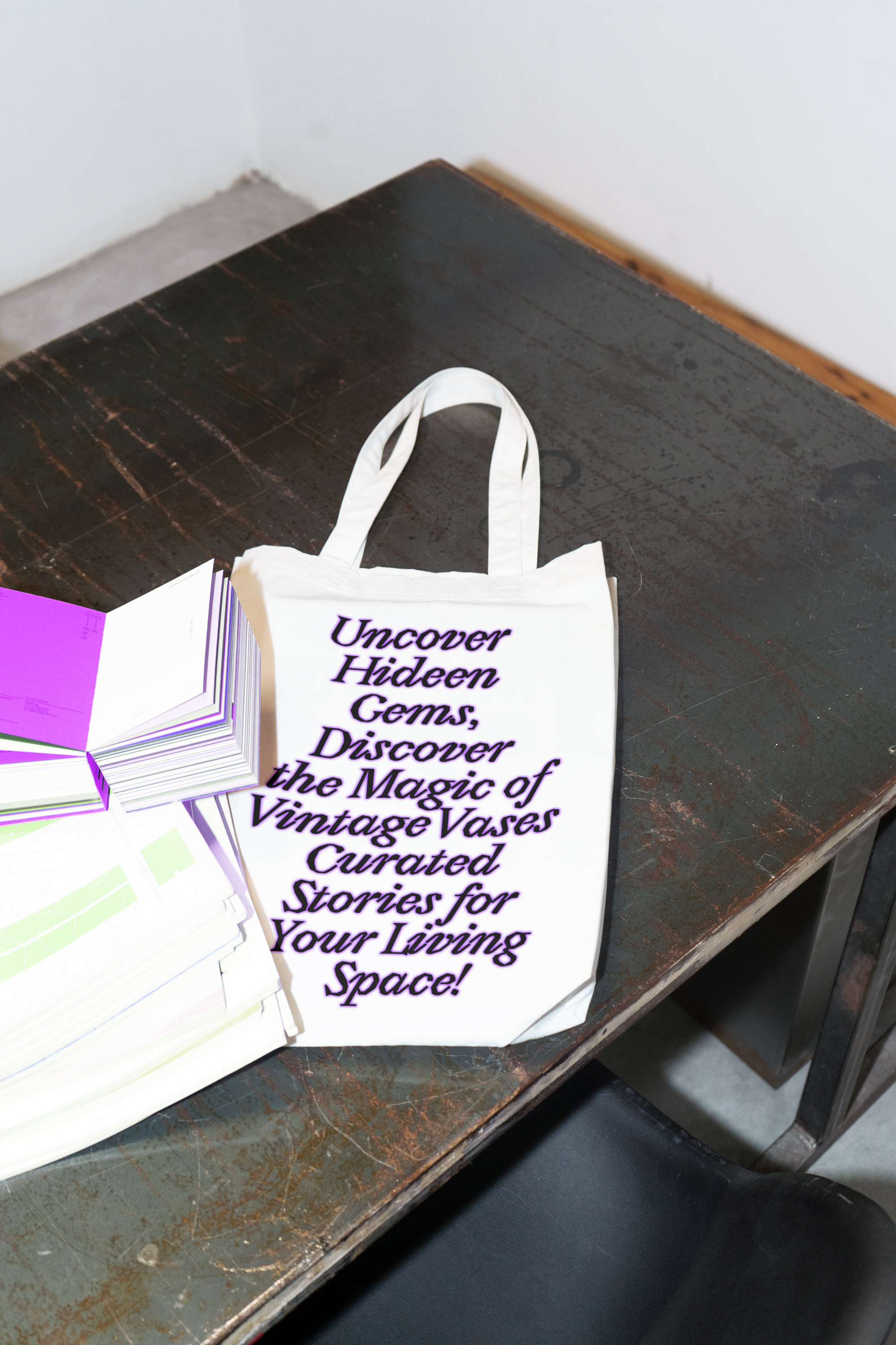
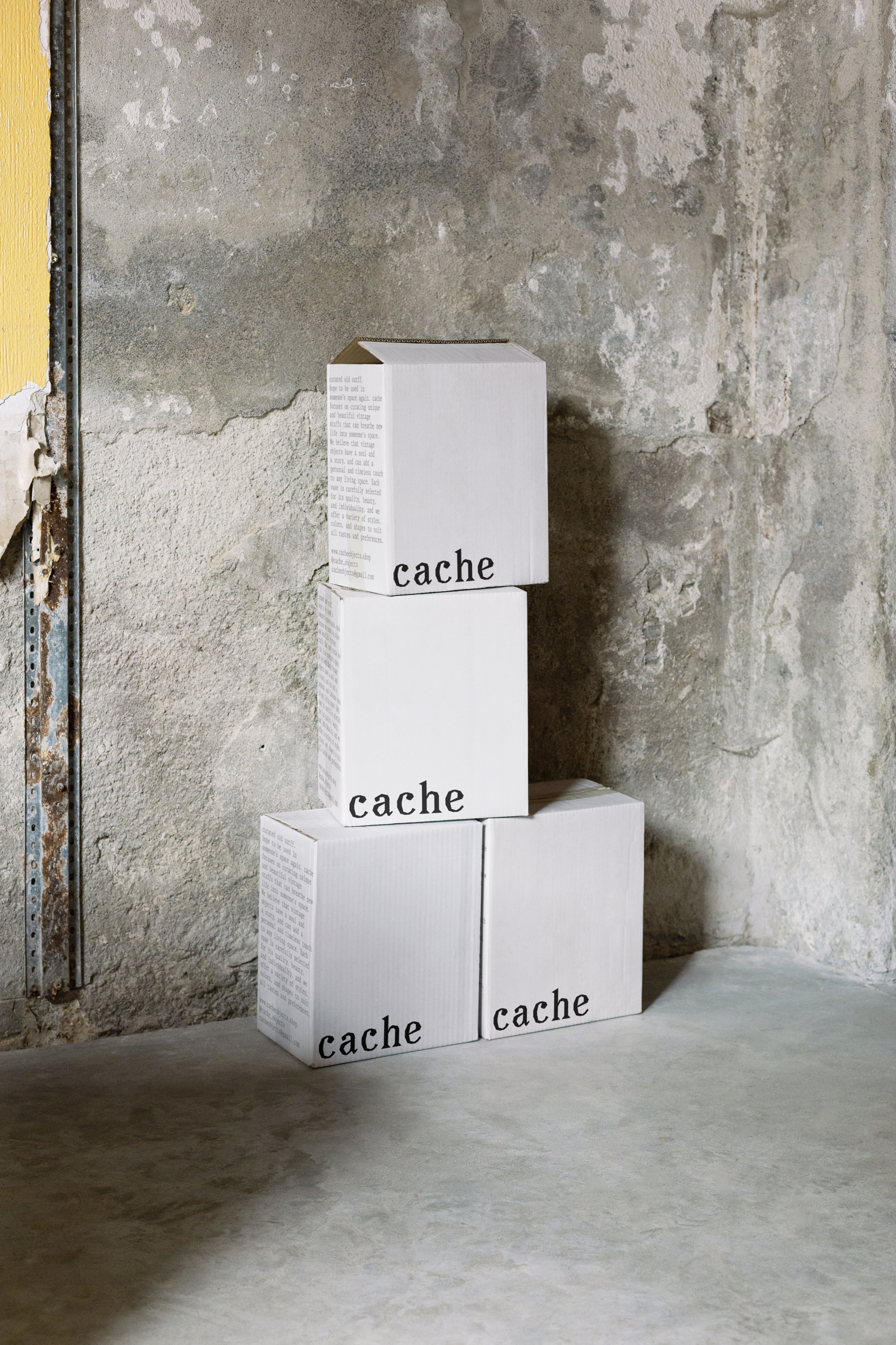
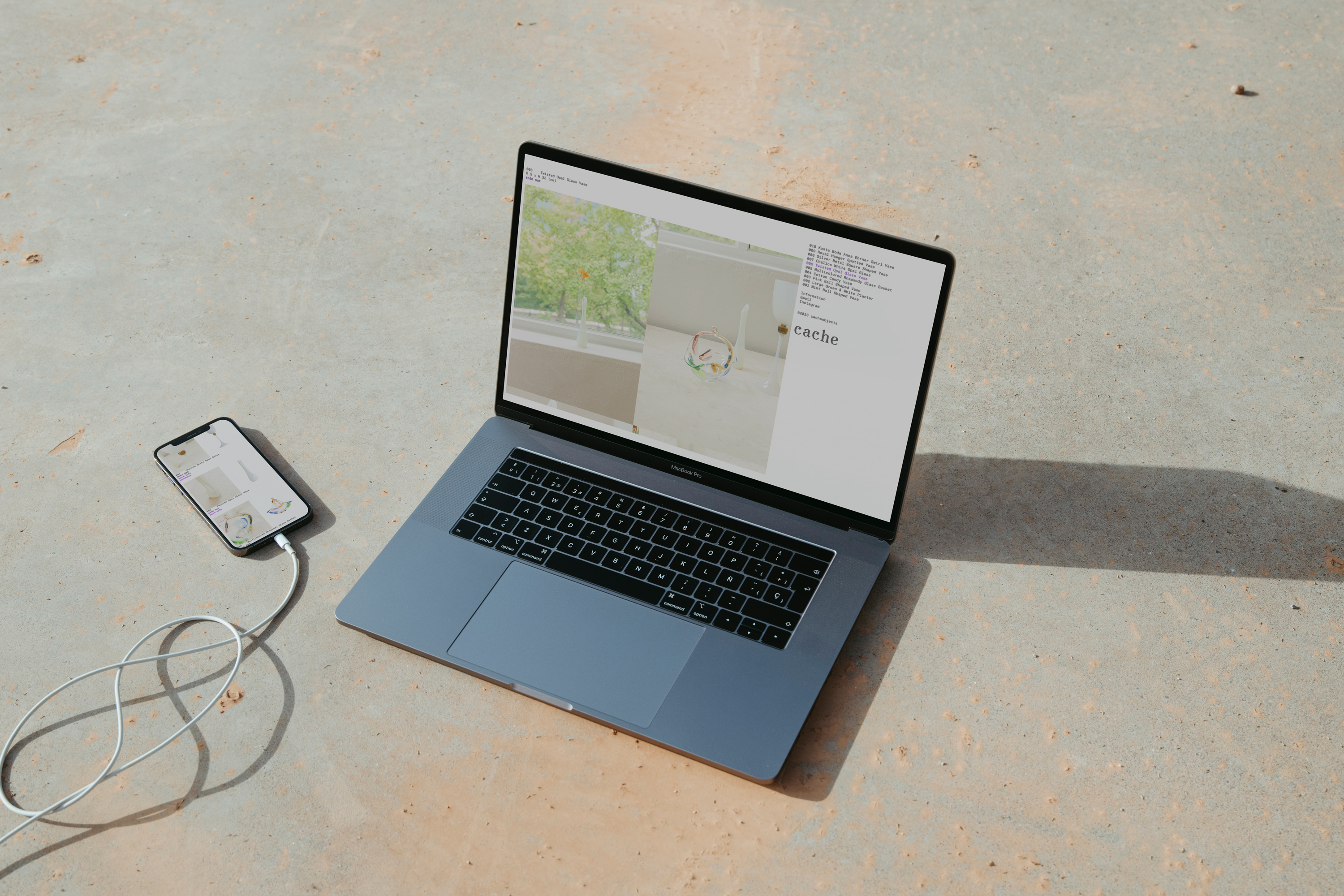
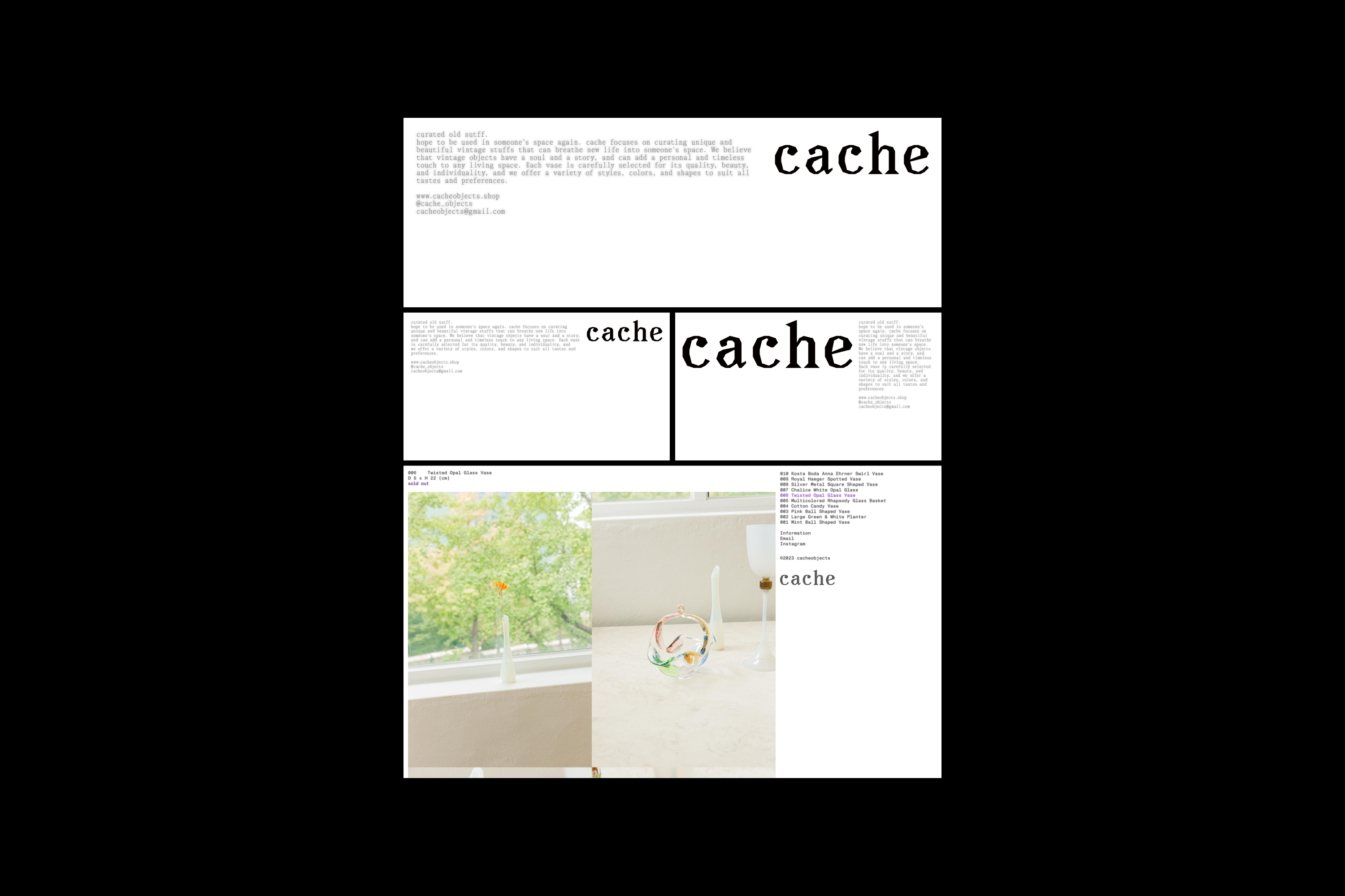
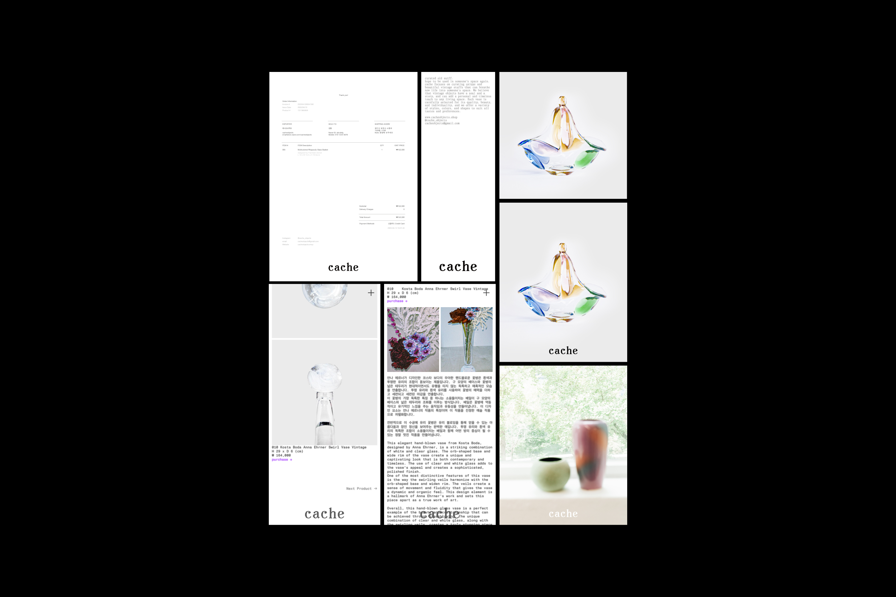
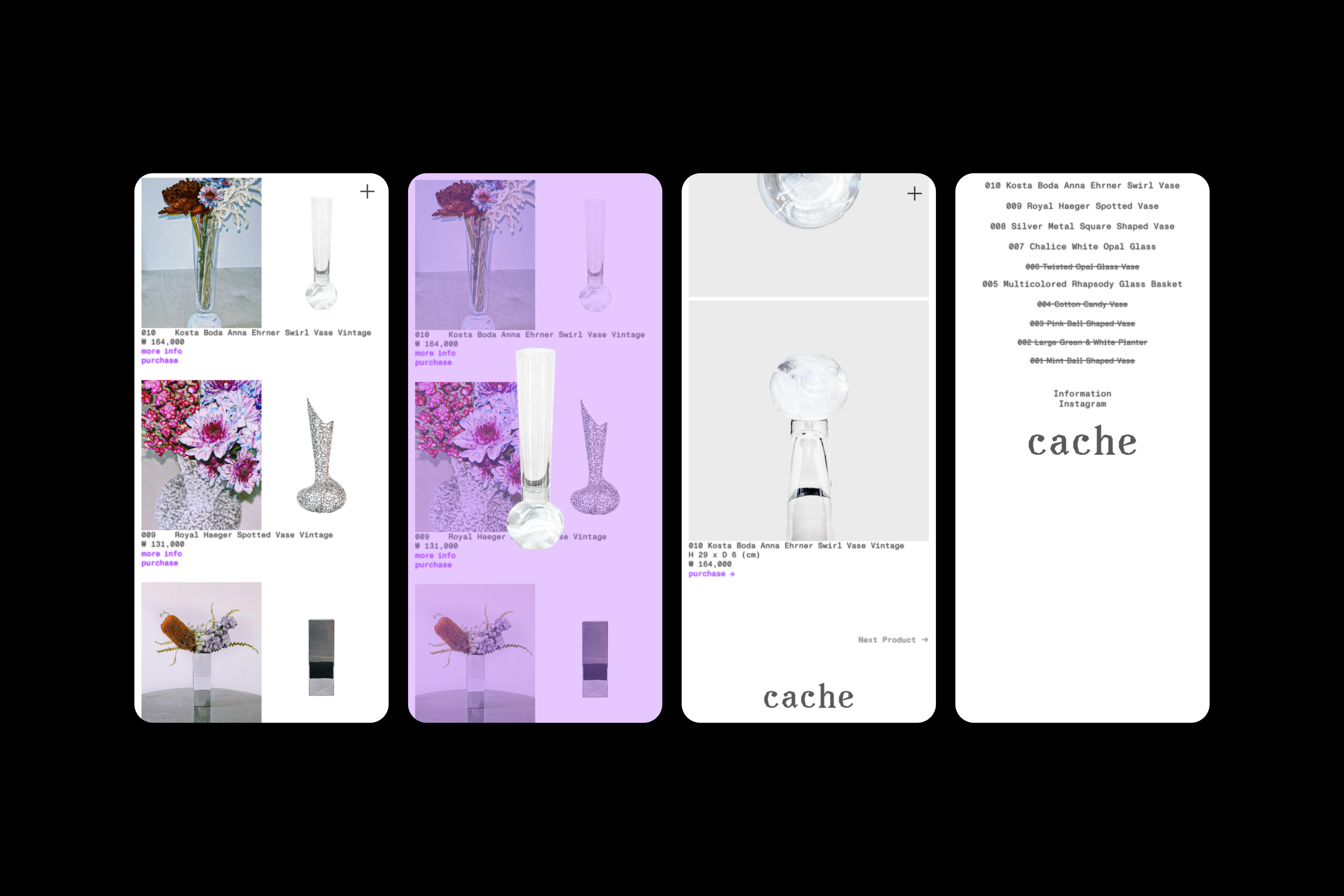
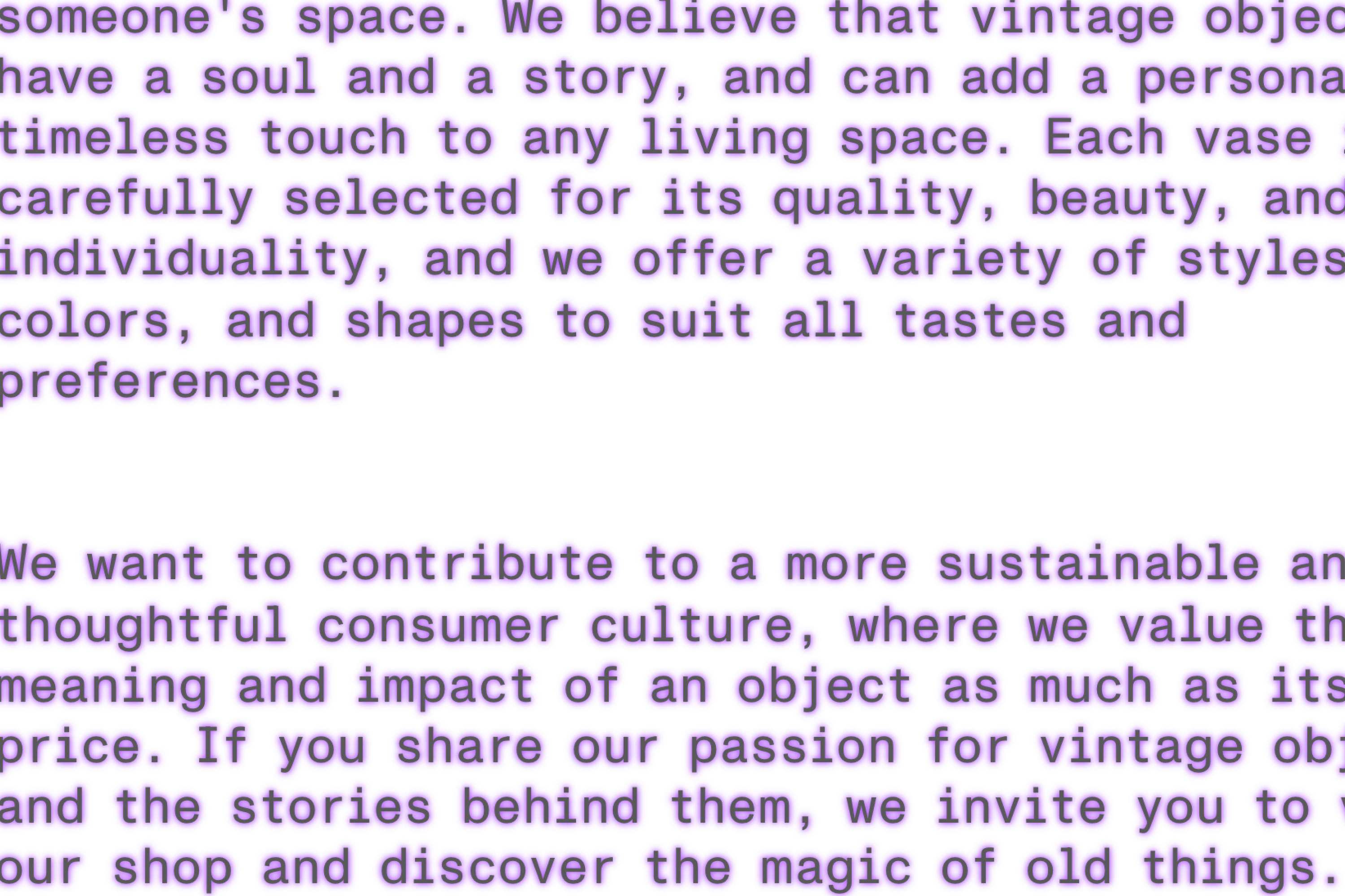
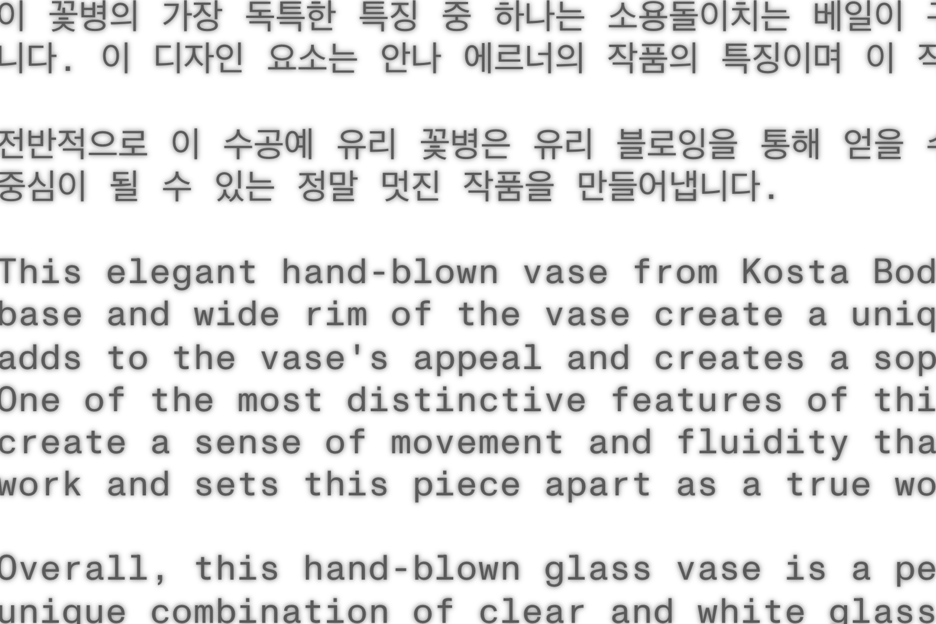
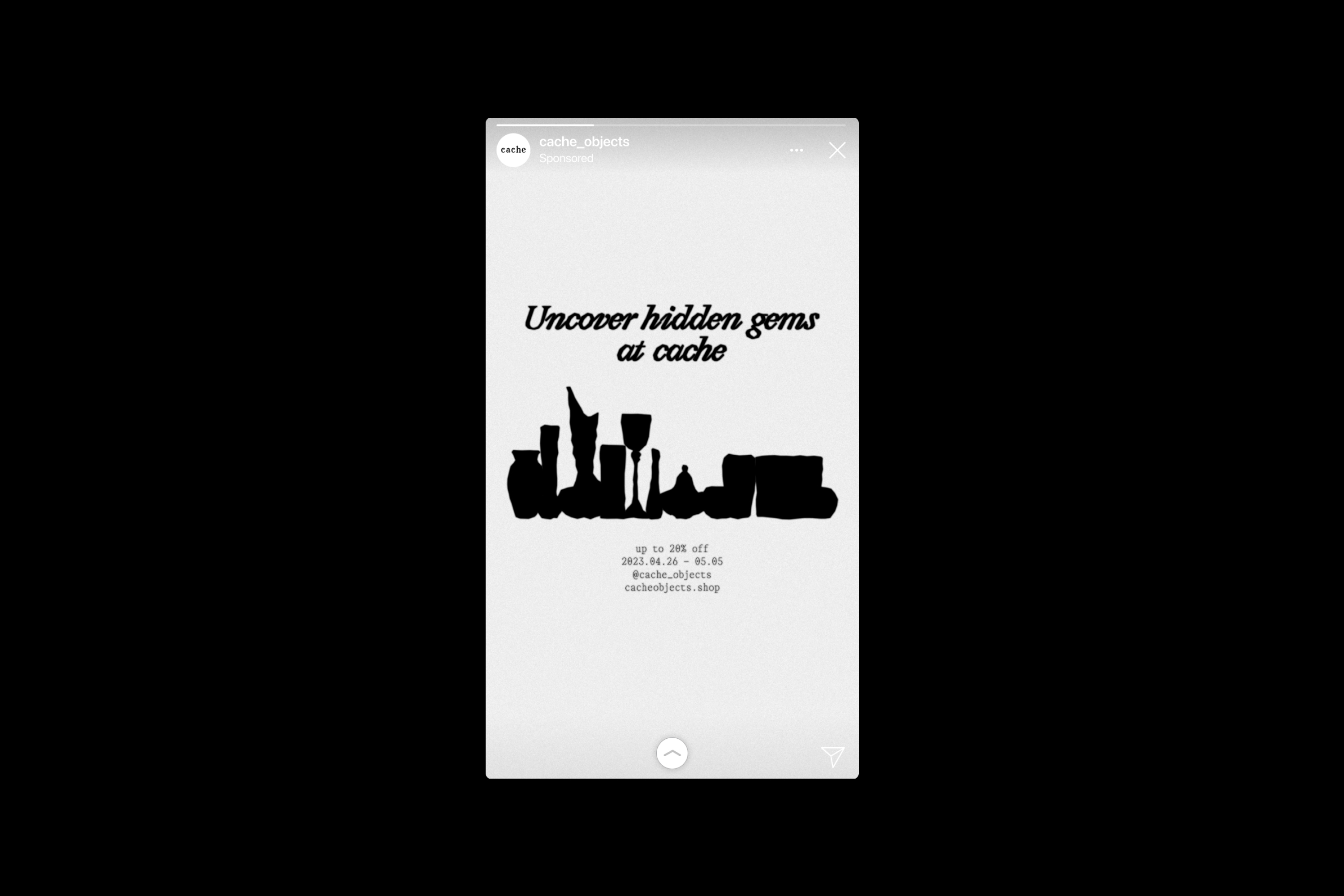
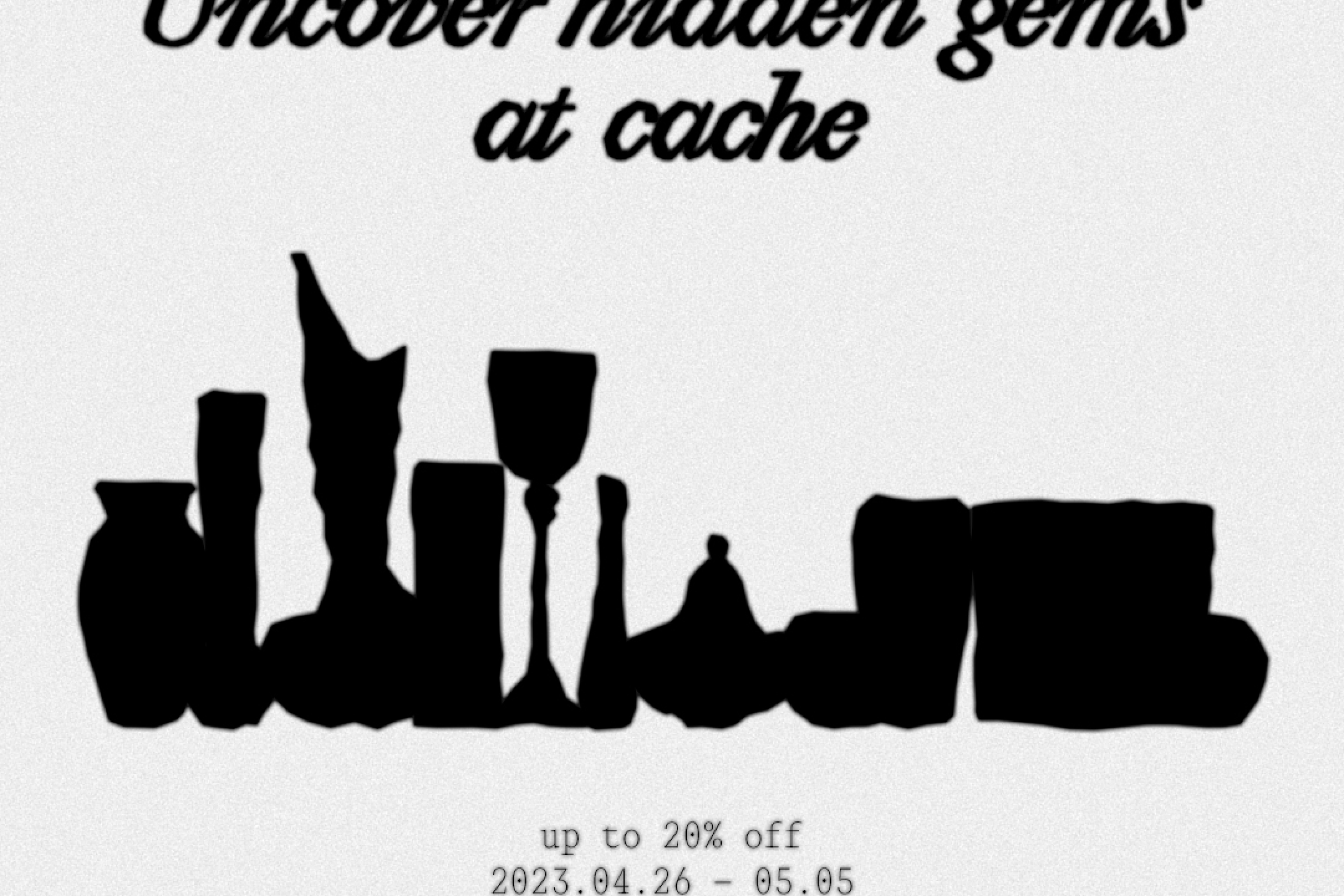
Cache Objects drew inspiration from the shared qualities between the internet term “cache” and vintage objects to shape its brand identity. On the internet, a cache stores data temporarily for quick access and reuse. Likewise, vintage items preserve stories and experiences from the past, brought back to life in a new context.
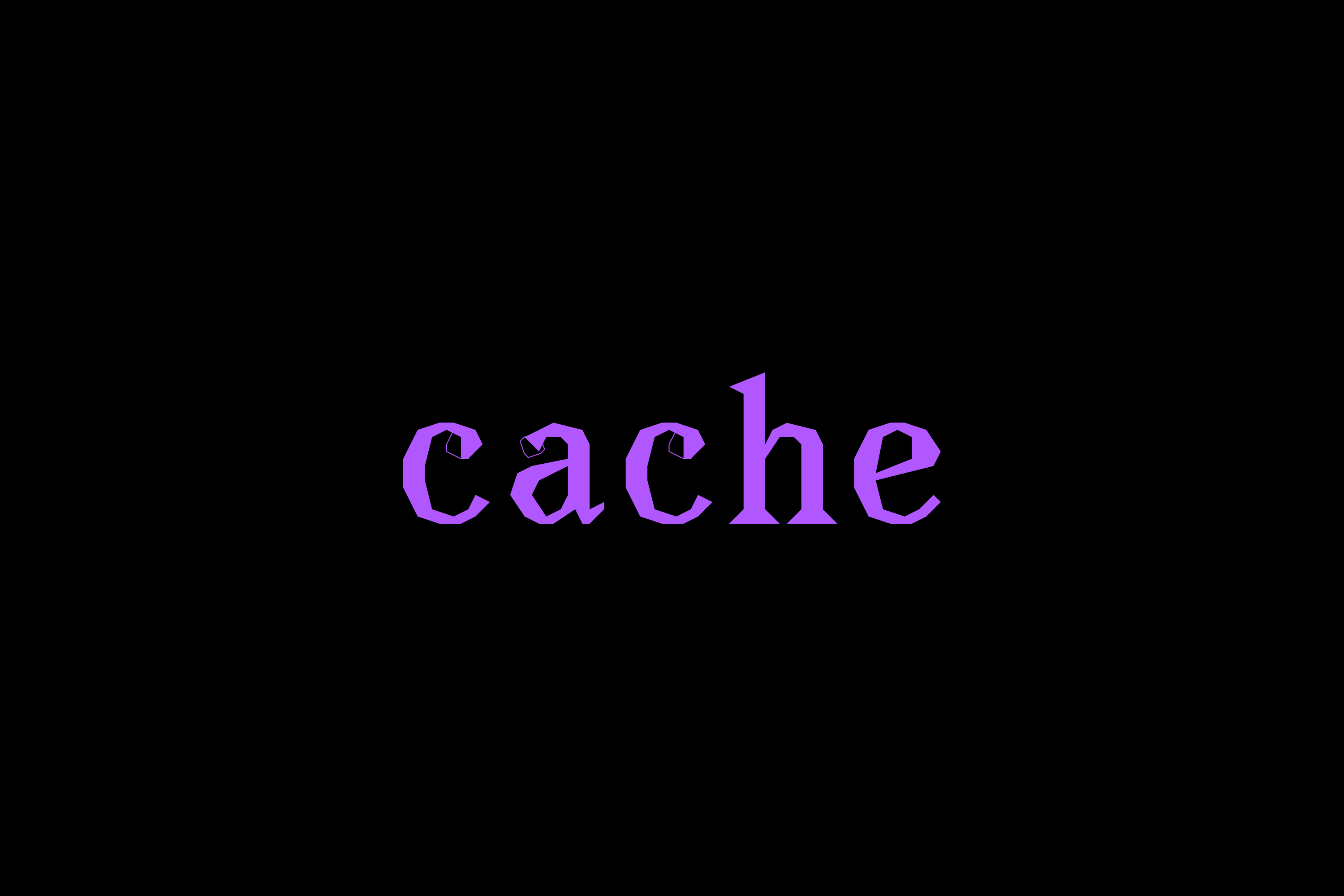
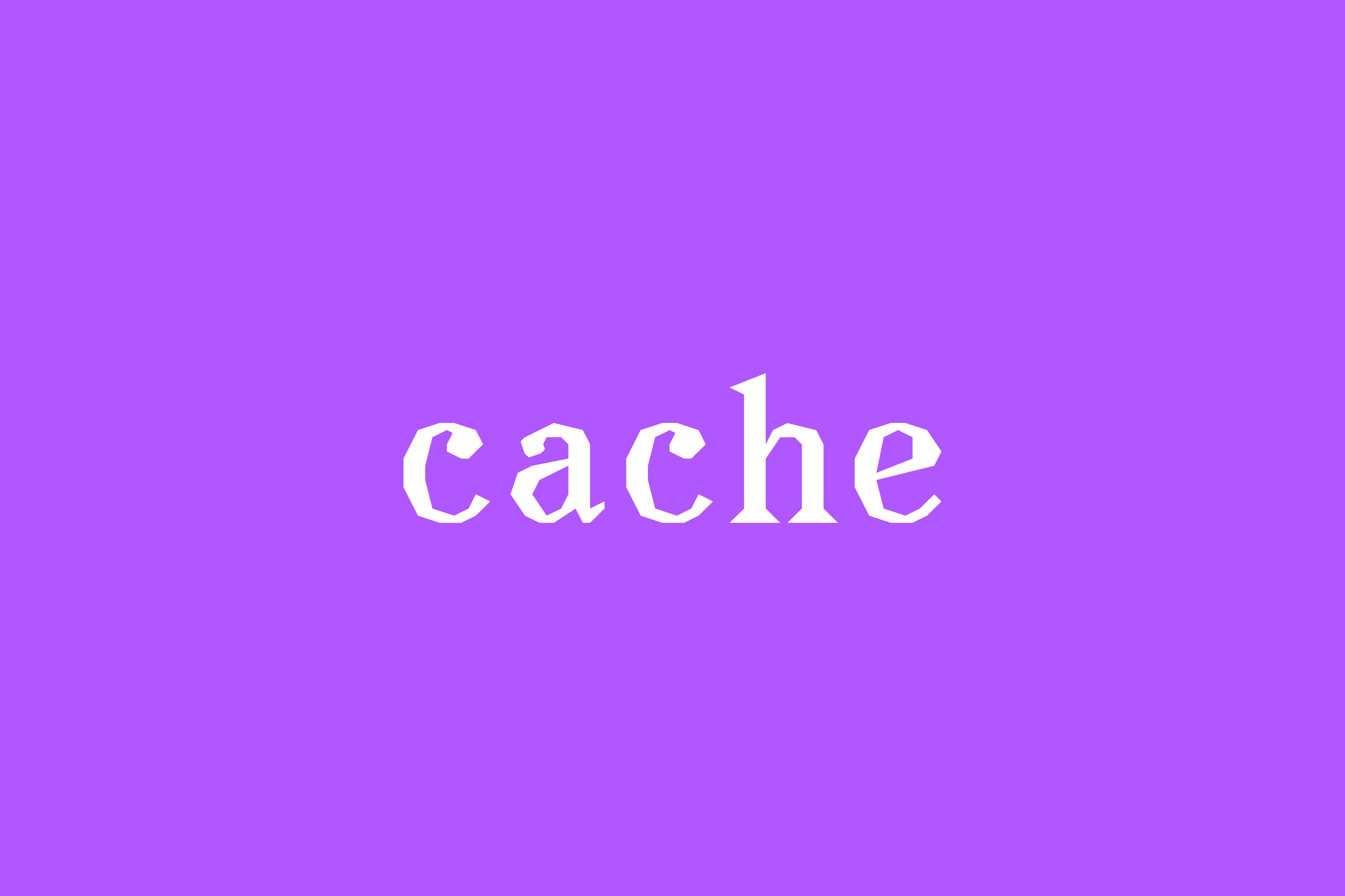
Building on these parallels, Cache developed a visual identity that captures a sense of memory and emotional resonance. The logo design uses a small font size and blurred text to express the fading yet persistent connection between past and present. This subtle visual treatment reinforces the brand’s unique character and enhances its recognizability.
Cache Objects, 2023, Categories : Brand Identity, Graphic Identity, Logo, Website, Poster, Card, Package
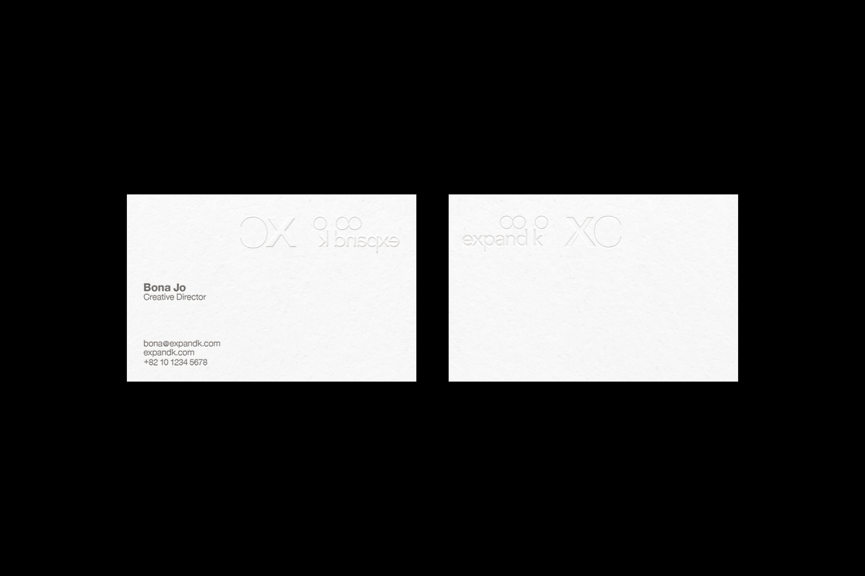
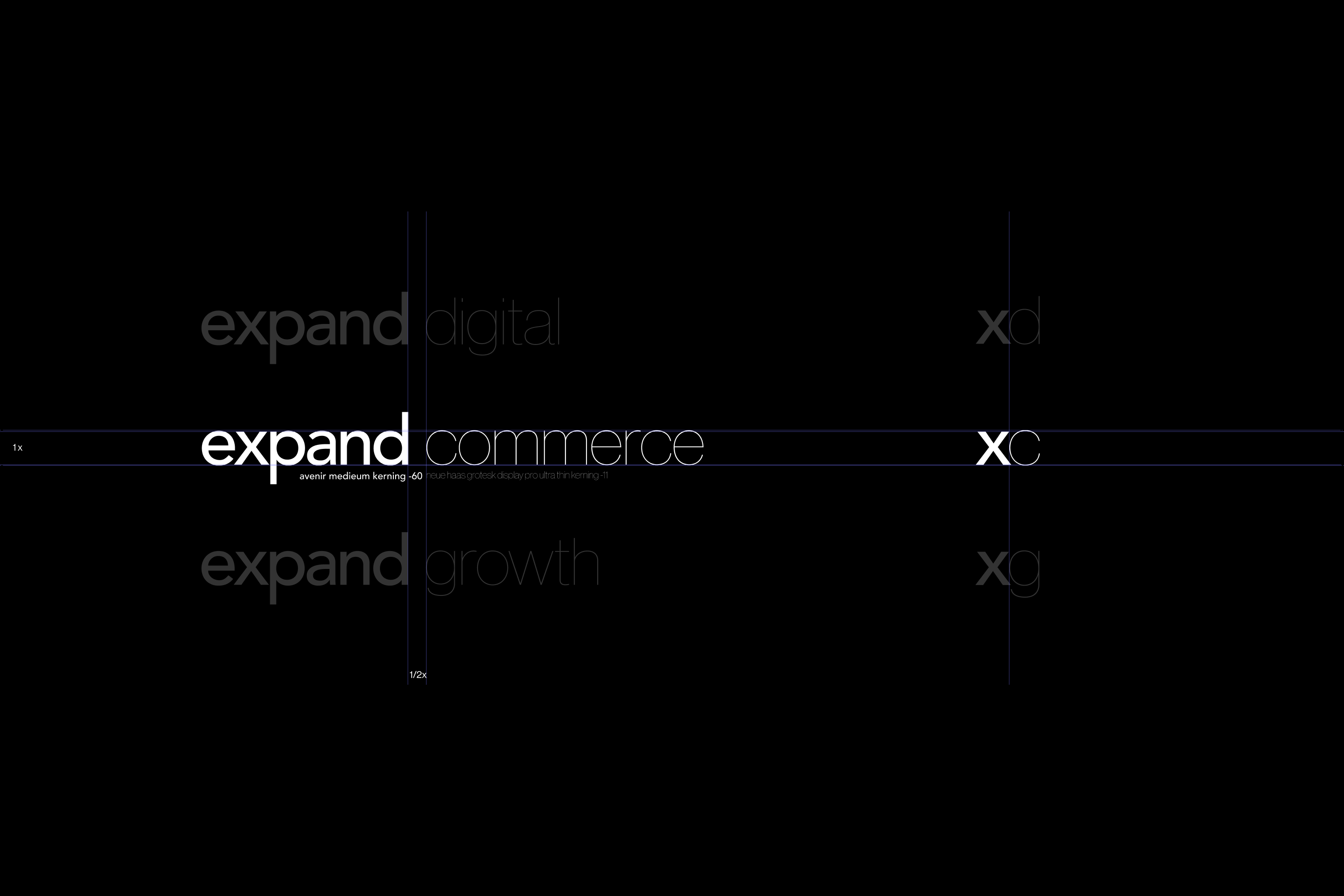
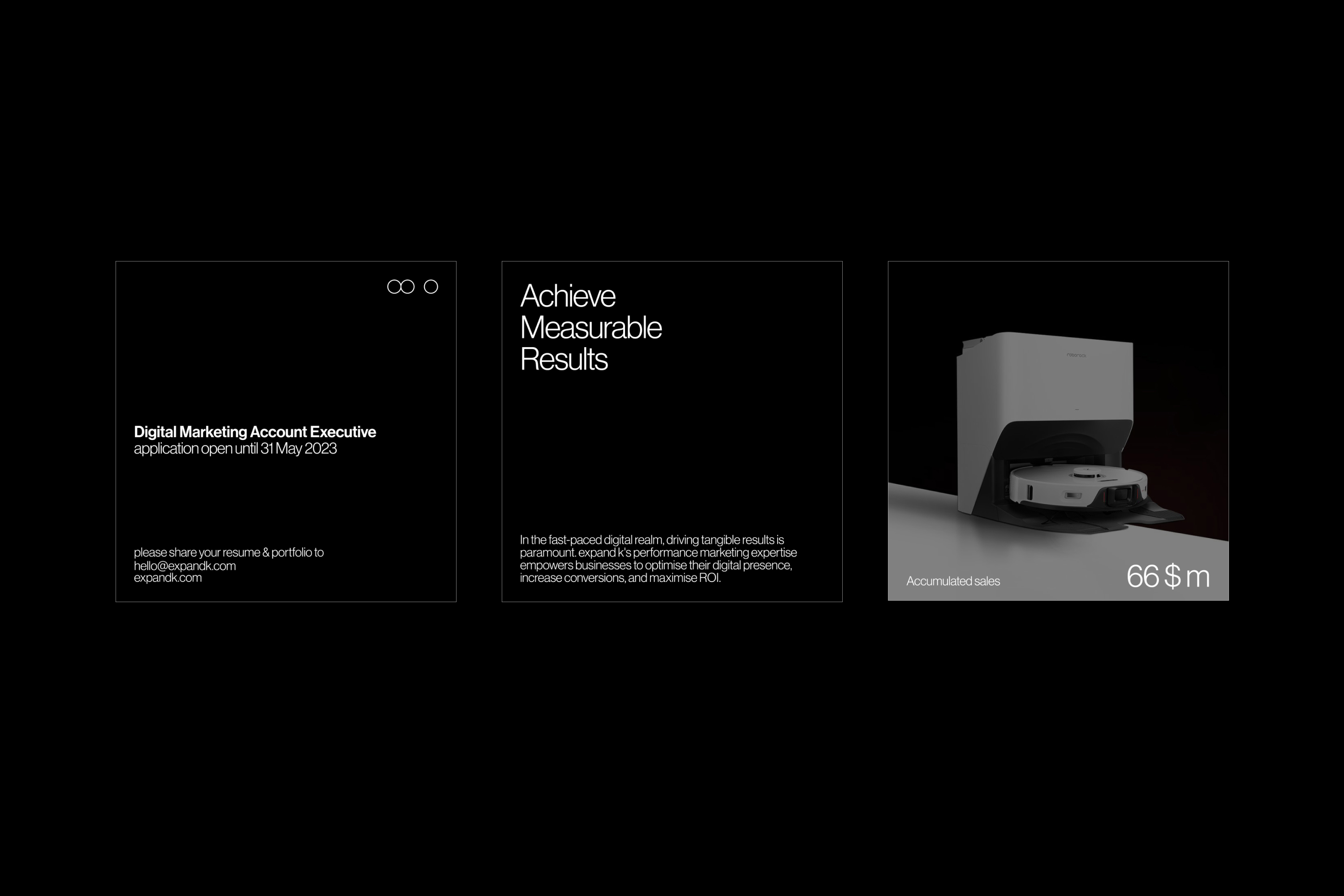

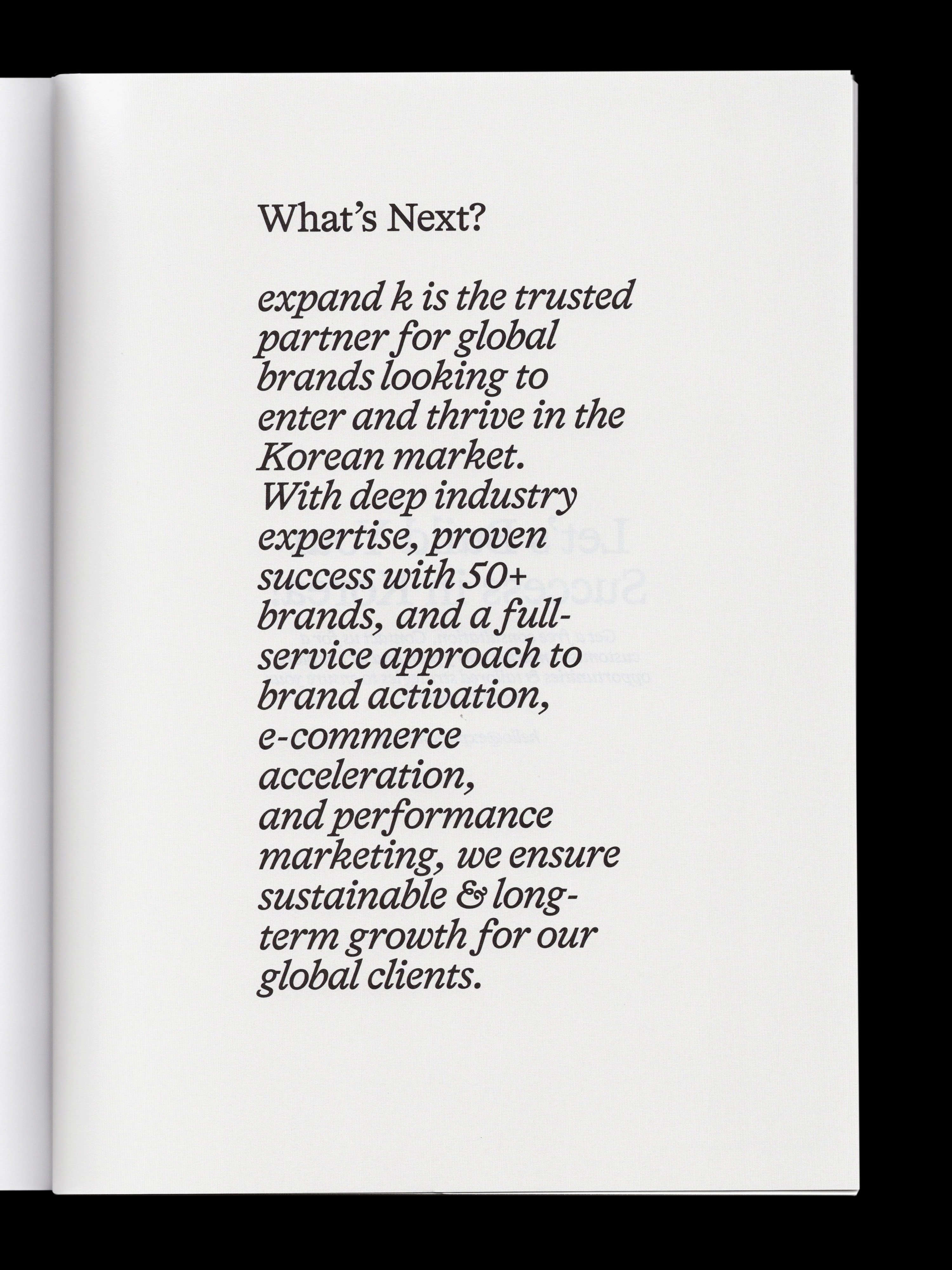
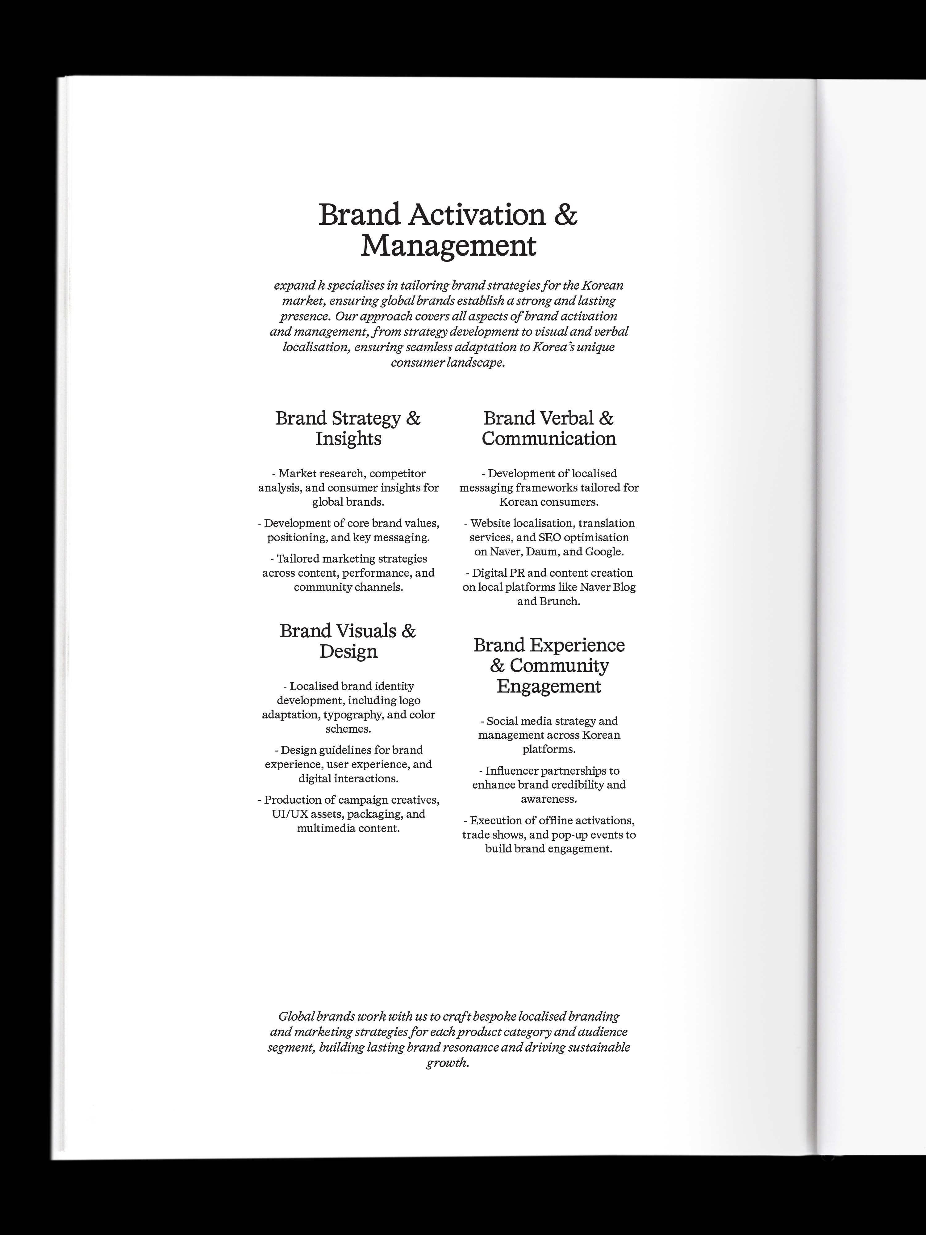
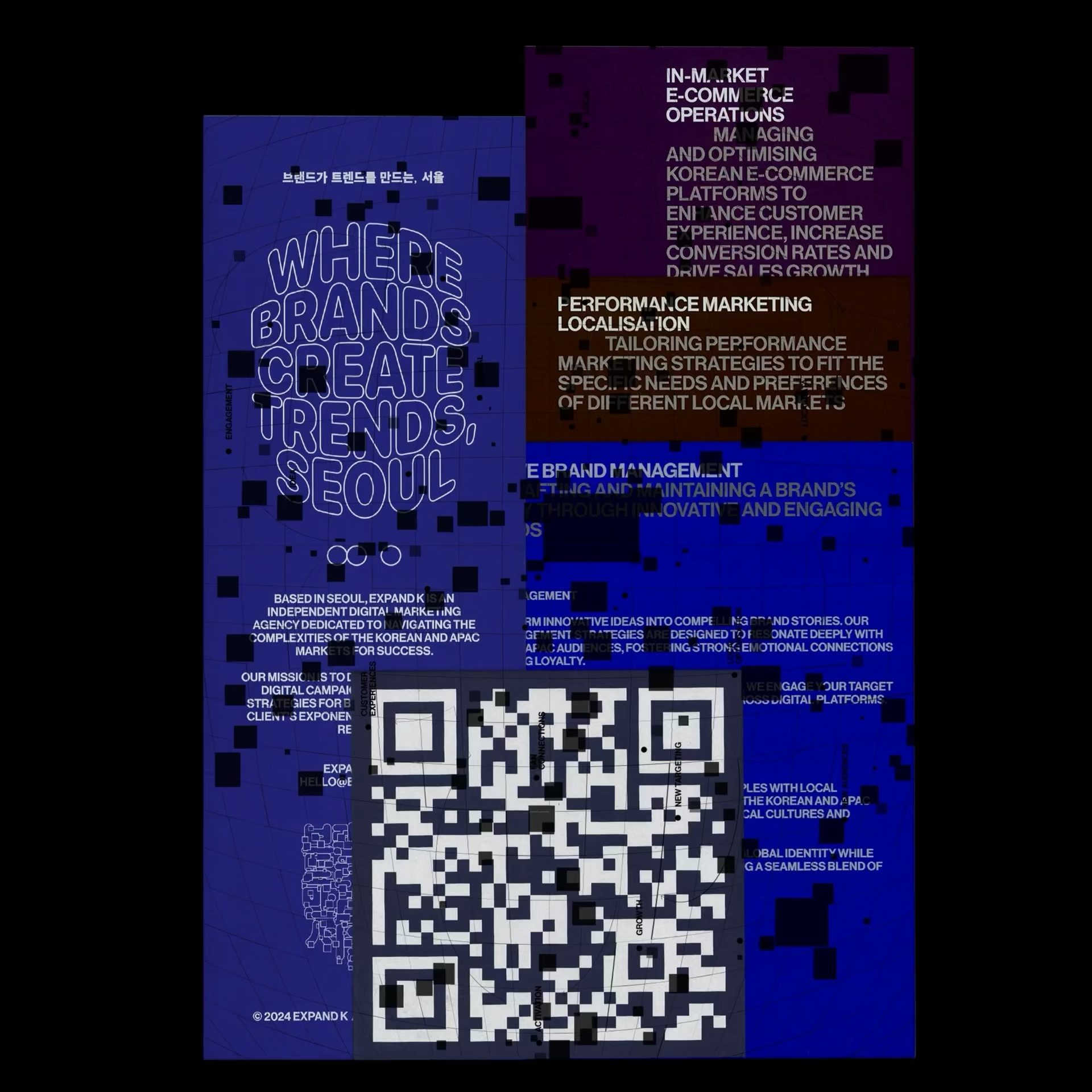
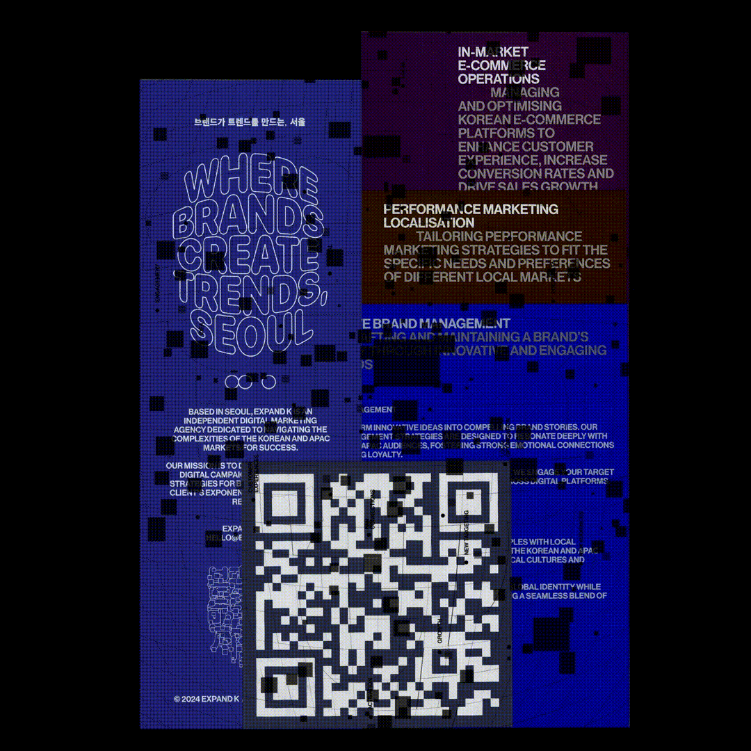
A symbolic logo captures the company's vision, also was produced by visualizing the acceleration of clients' entryway into Korea through expand k. The logo has vertical and horizontal versions for use for different layout.
Maintaining the existing logo font, Avenir is used as primary typefaces, also in logo. To show the expertise of the service, combinate with refined and simple typefaces.
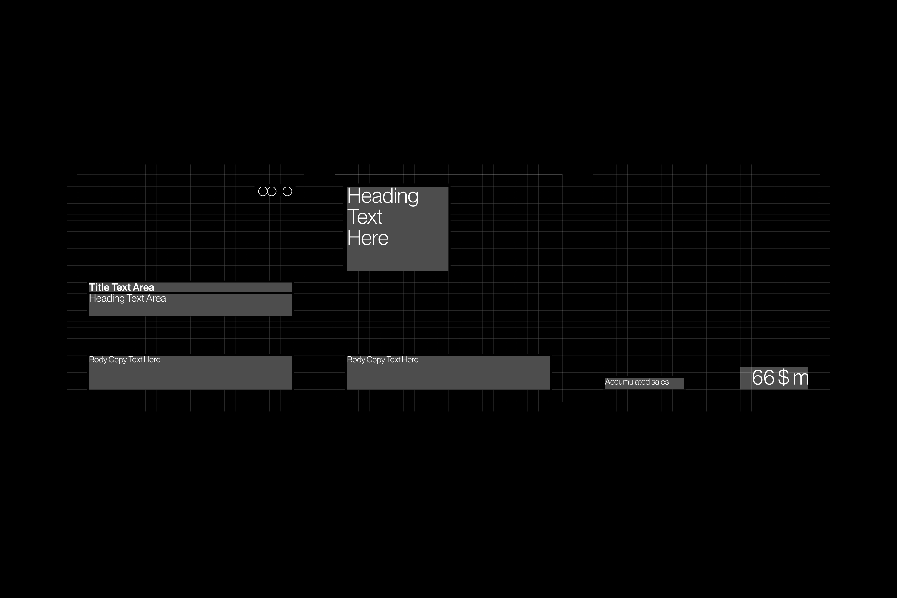
Created system guide for brand concepts, logo regulations, colors, and typography to capture consistently and effectively.
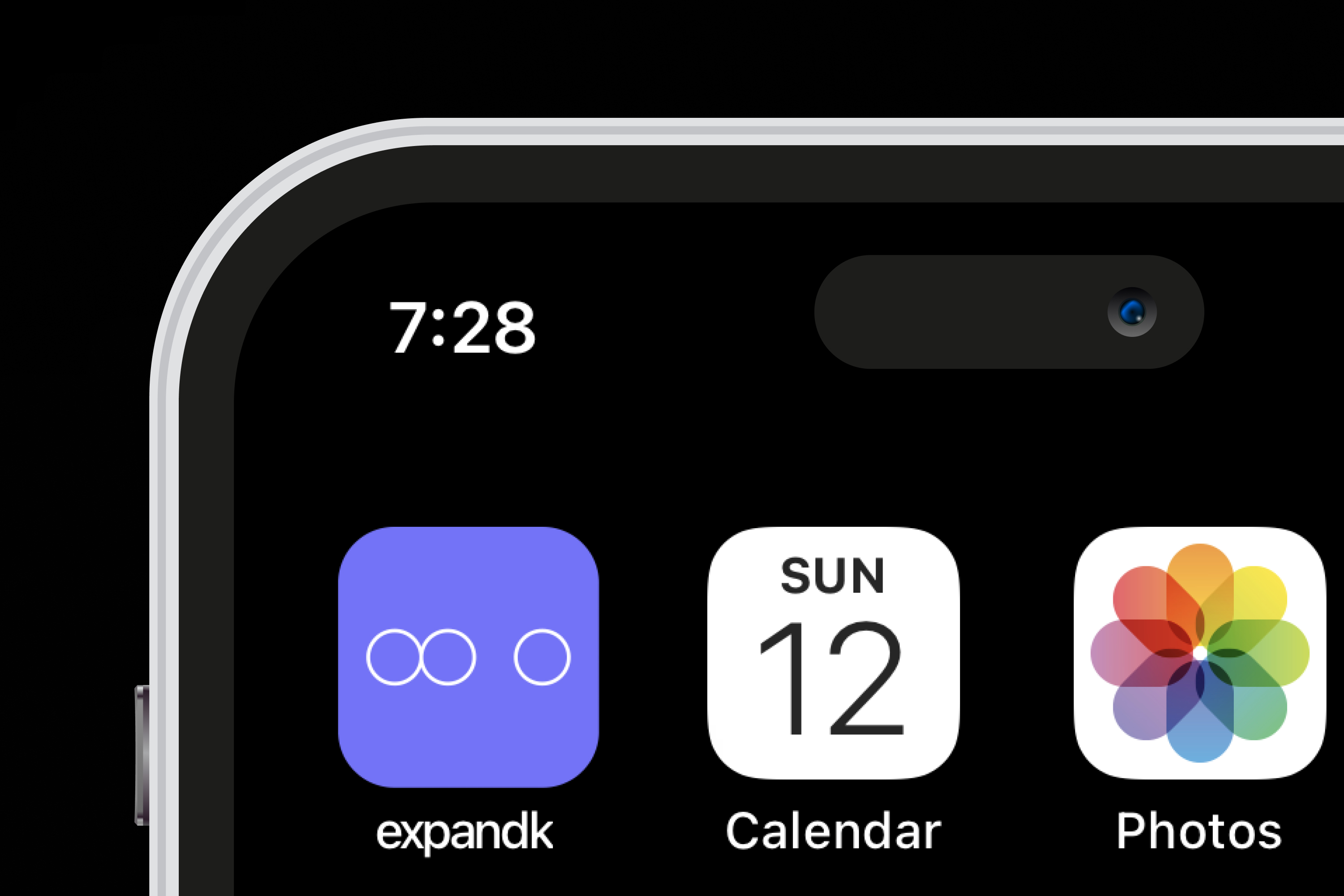
xk, 2022, Categories : Brand Identity, Graphic Identity, Logo, Website, Card, Brand Manual
xk, 2022, Categories : Brand Identity, Graphic Identity, Logo, Website, Card, Brand Manual


A symbolic logo captures the company's vision, also was produced by visualizing the acceleration of clients' entryway into Korea through expand k. The logo has vertical and horizontal versions for use for different layout.
Maintaining the existing logo font, Avenir is used as primary typefaces, also in logo. To show the expertise of the service, combinate with refined and simple typefaces.
Created system guide for brand concepts, logo regulations, colors, and typography to capture consistently and effectively.
Visit here
xk, 2022, Categories : Website
Visit here
xk, 2022, Categories : Website