

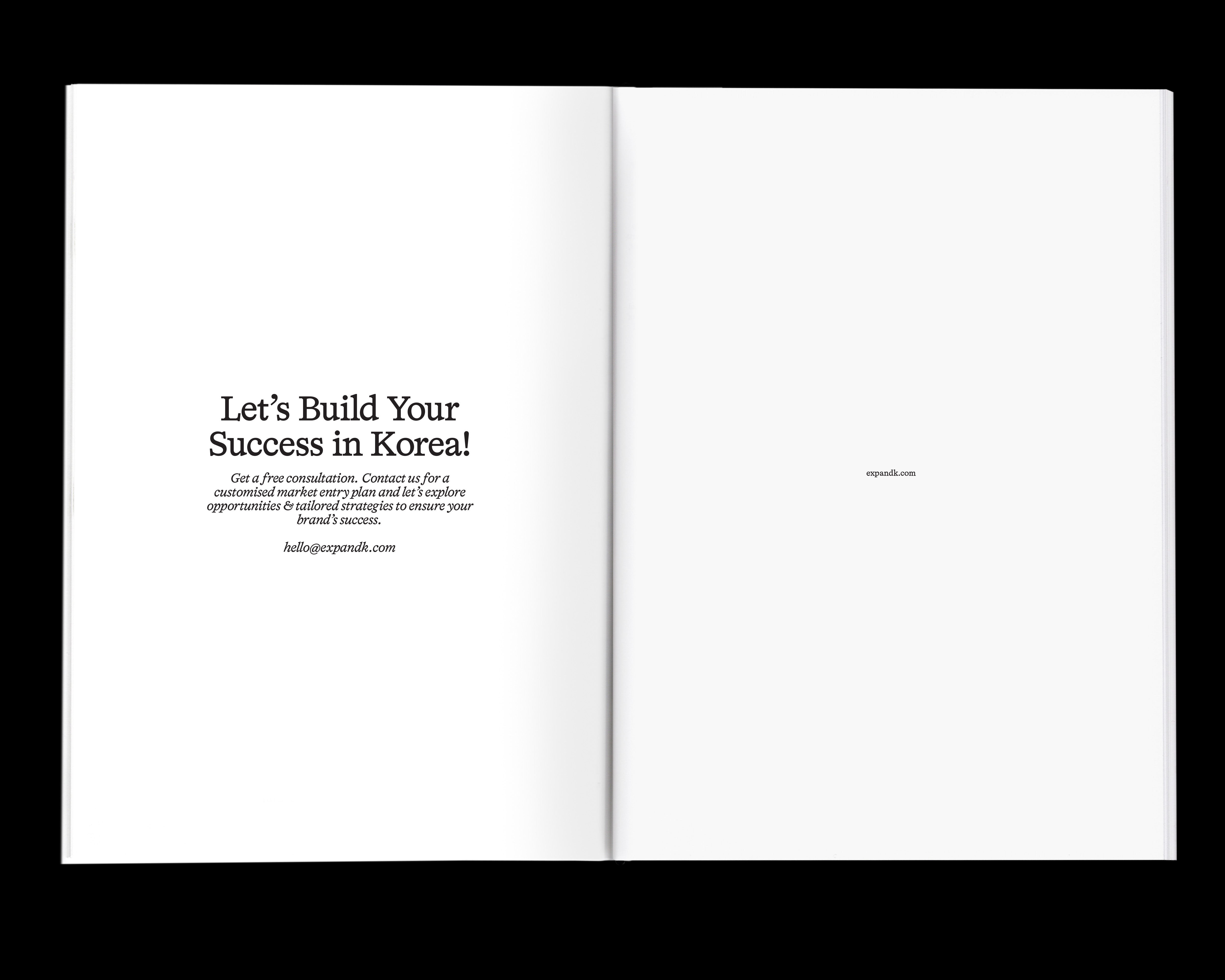
#1 – Thirty in 2 Hours 28 Minutes
April, 2025 – Focus Flow
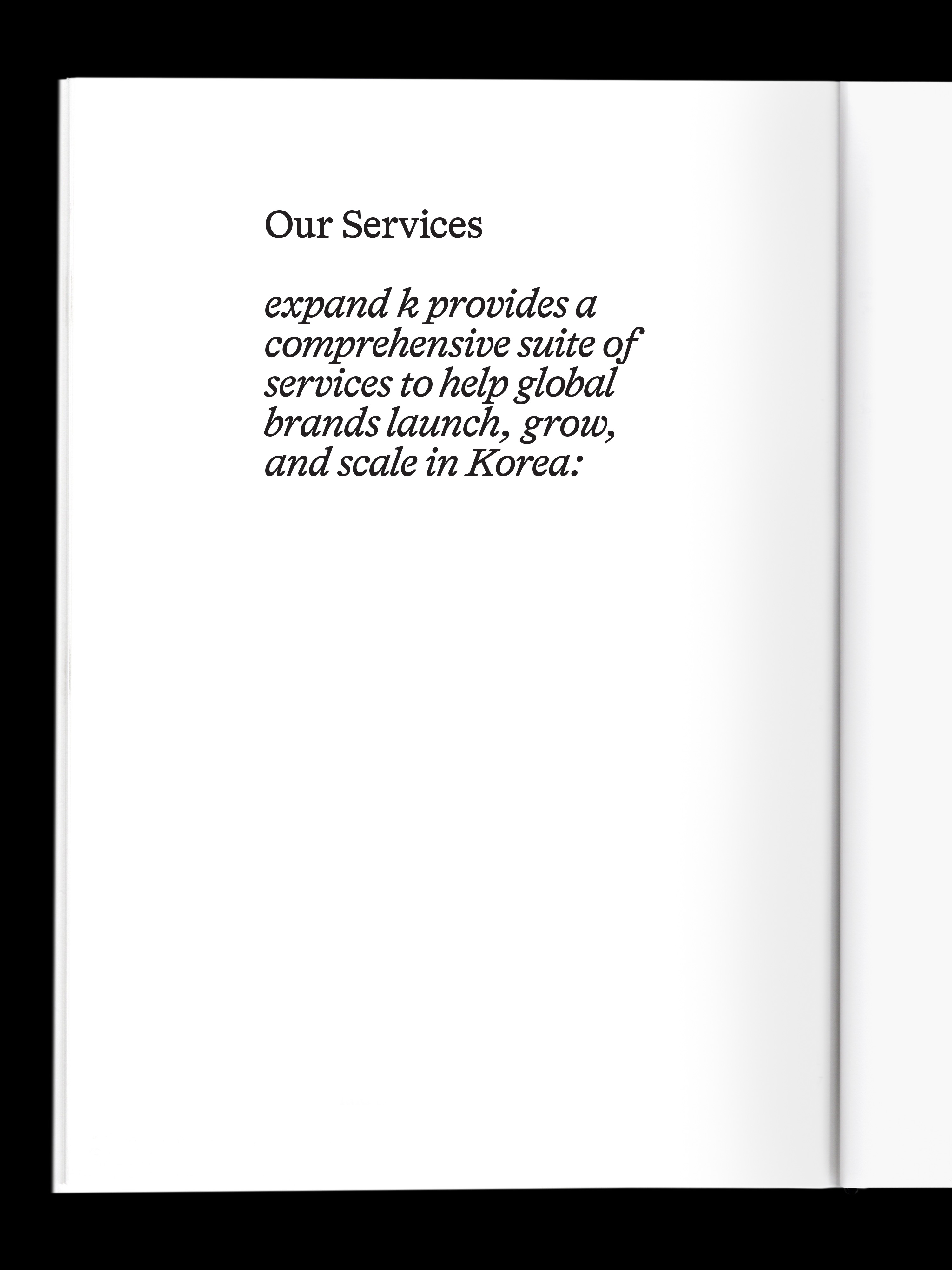
Apple Music, Spotify, Categories : Illustration
April, 2025 – Focus Flow
Apple Music, Spotify, Categories : Illustration
LDN 2025 Agency Book, 2025, 2025, Categories : Printed Matter, Editorial Design
DMA 2024 Borochure Experiment, 2024, Categories : Graphic Identity, Printed Matter


Poster for Exhibition “Recomposition”, the alphabet was recomposed to create a recomposition.
Recomposition, 2024, Categories : Graphic Identity, Poster
Recomposition, 2024, Categories : Graphic Identity, Poster


blwk is a brand that promotes and supports Baby-Led Weaning in Korea. blwk makes it easier and more enjoyable for parents to start weaning, enjoy food and mealtimes, and help educate the next generation of children.
To understand the brand better, the initial step of the project was to interview the brand manager. Based on the interviews, the brand was developed by emphasising 'enjoyable mealtimes' as the main keyword and aiming for a soft and friendly brand that parents could share their concerns with. The brand identity was developed with the aim of creating a soft, friendly brand that parents could share their concerns with.
blwk, 2024, Categories : Brand Identity, Graphic Identity, Website, Poster, Card
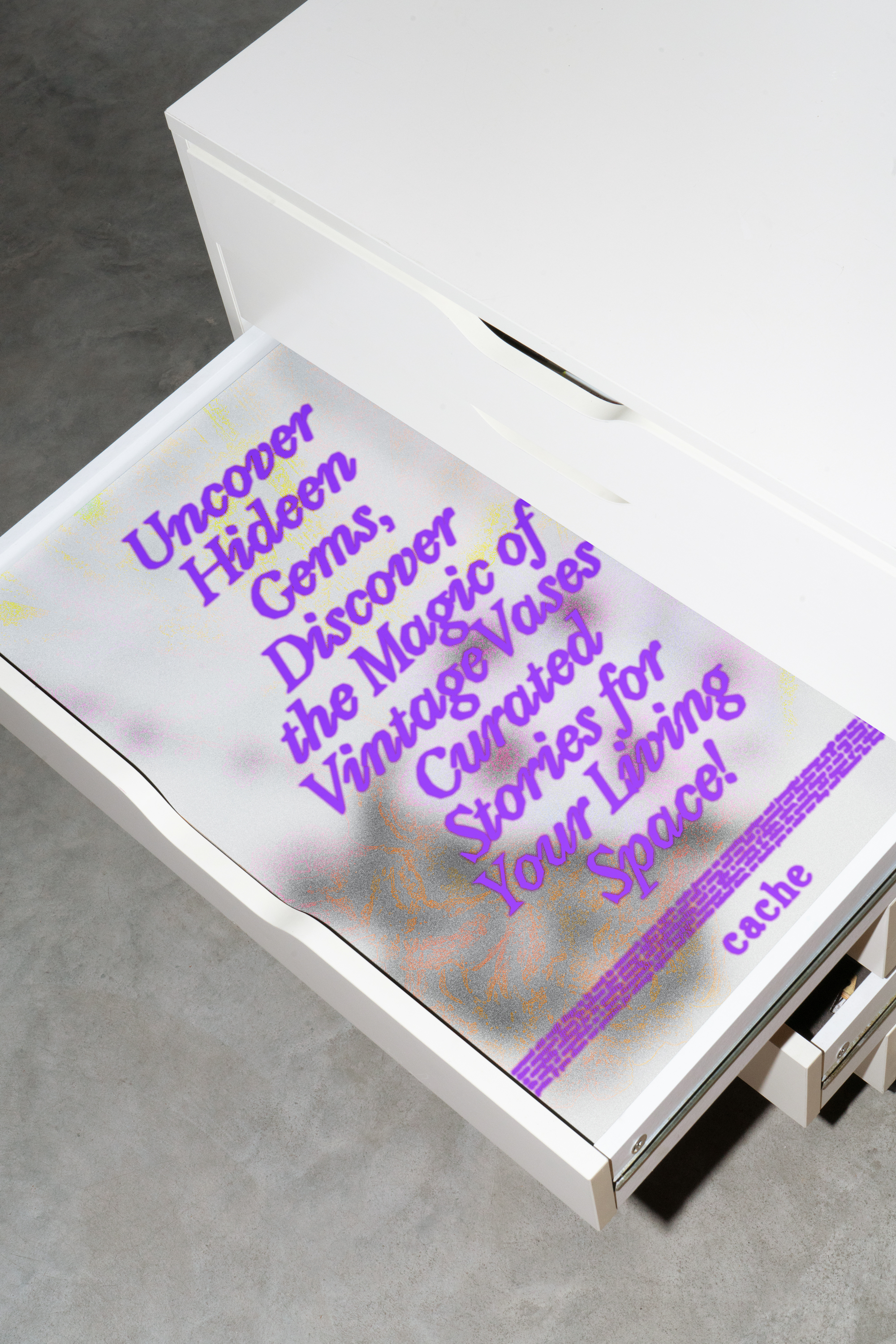
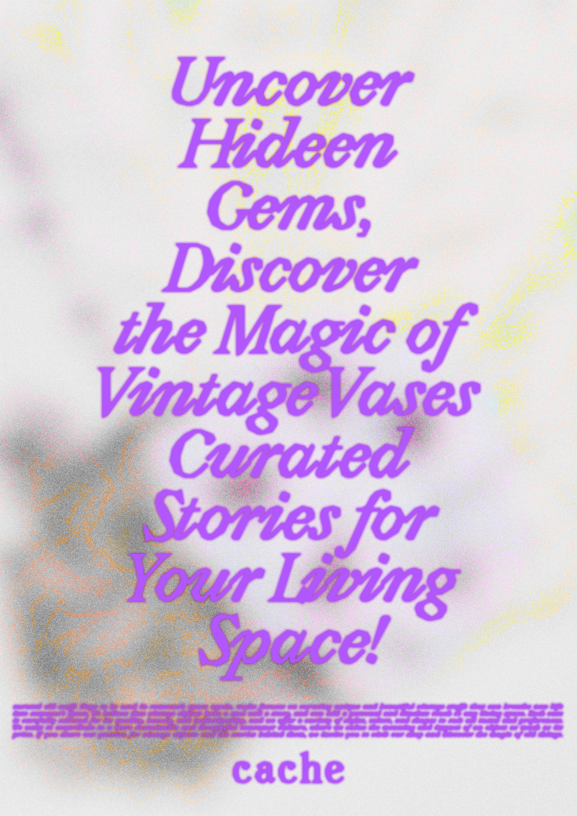
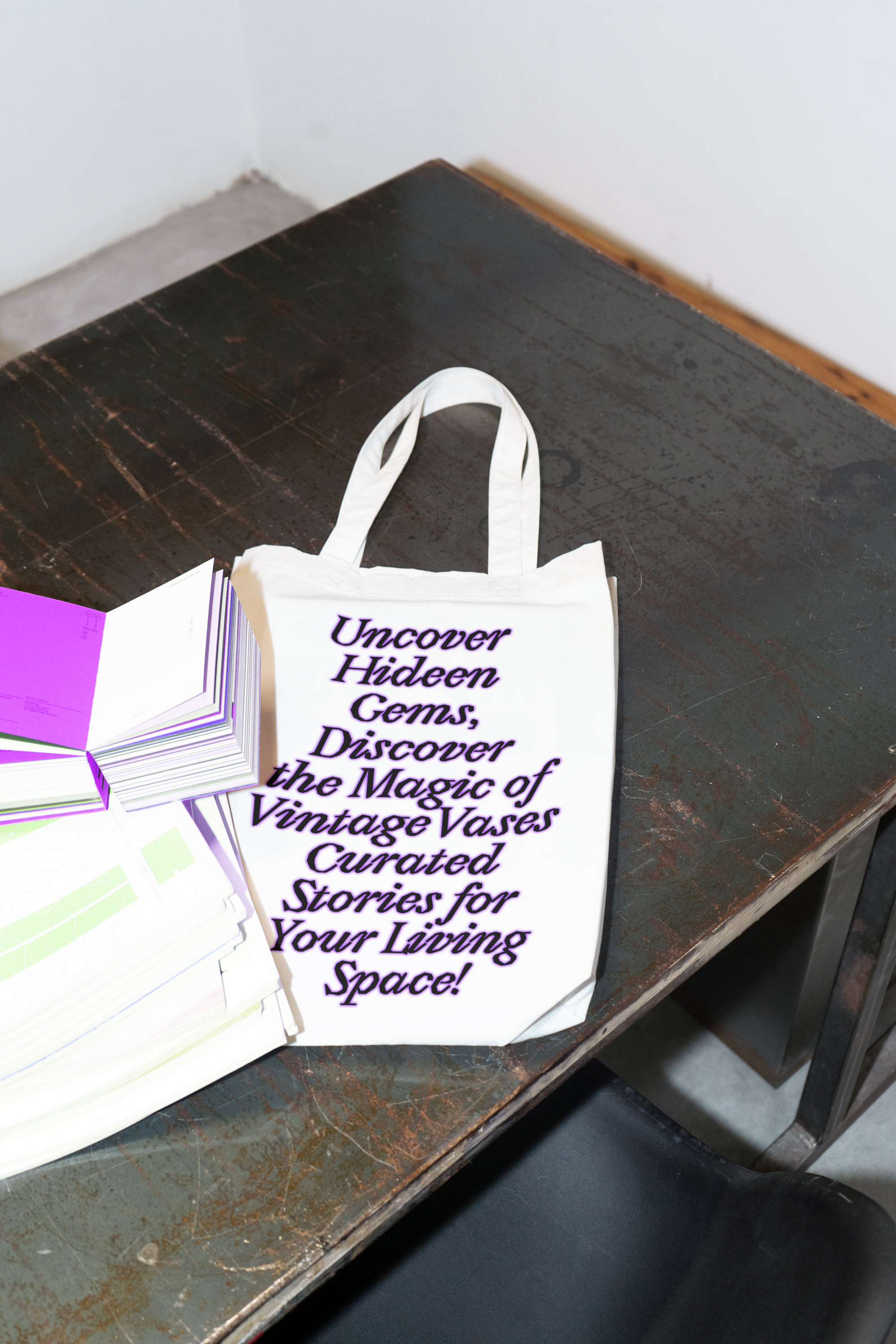
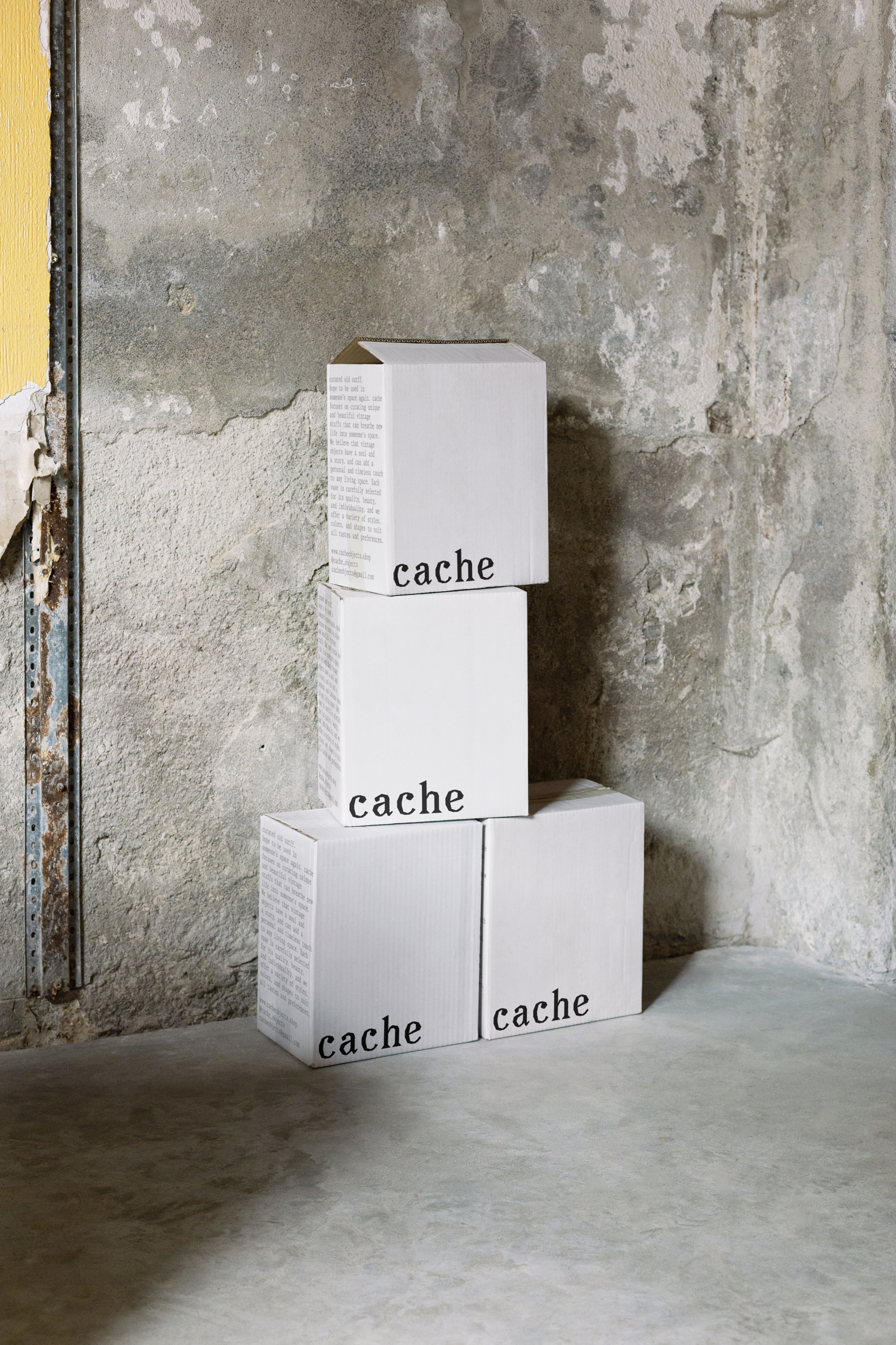
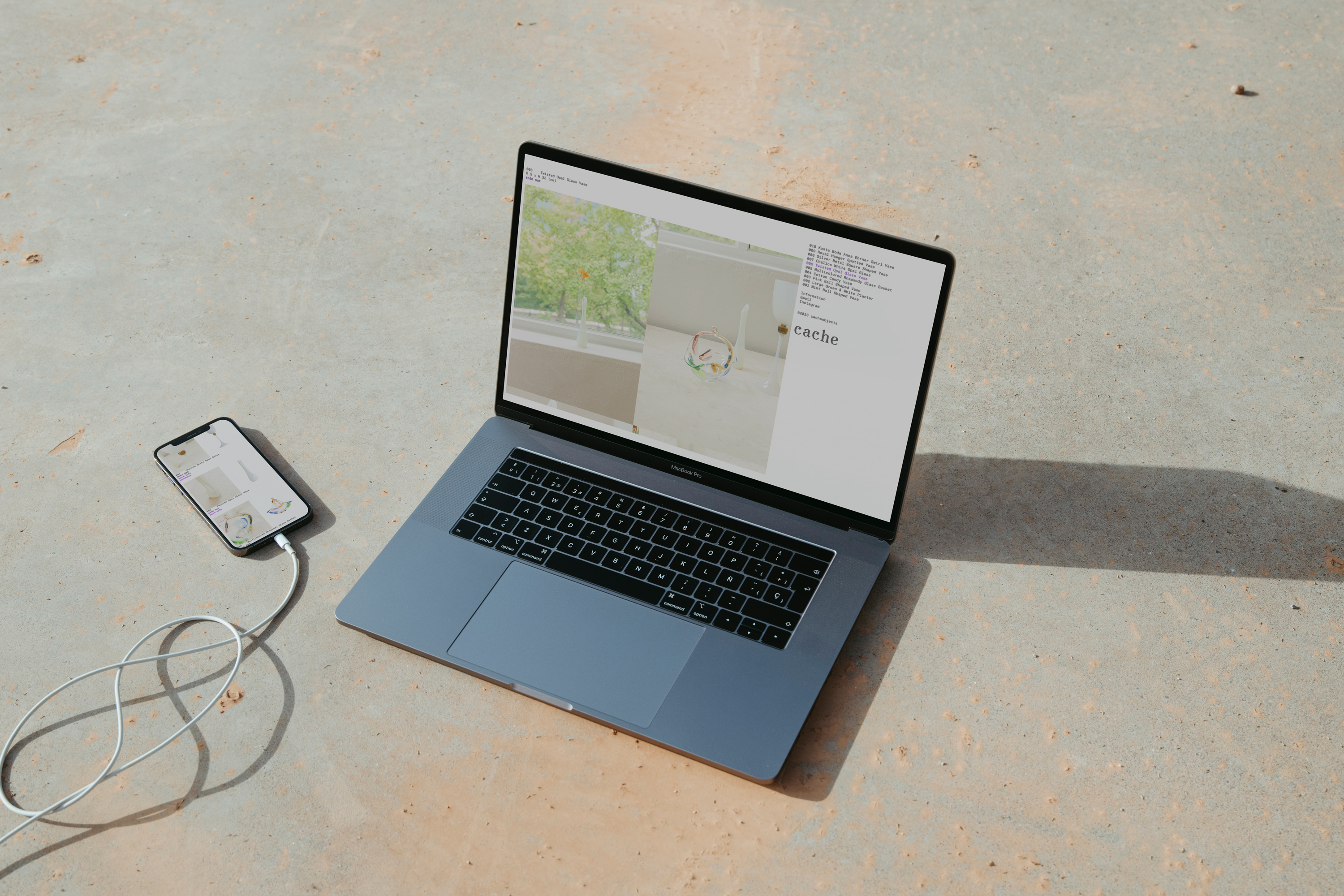
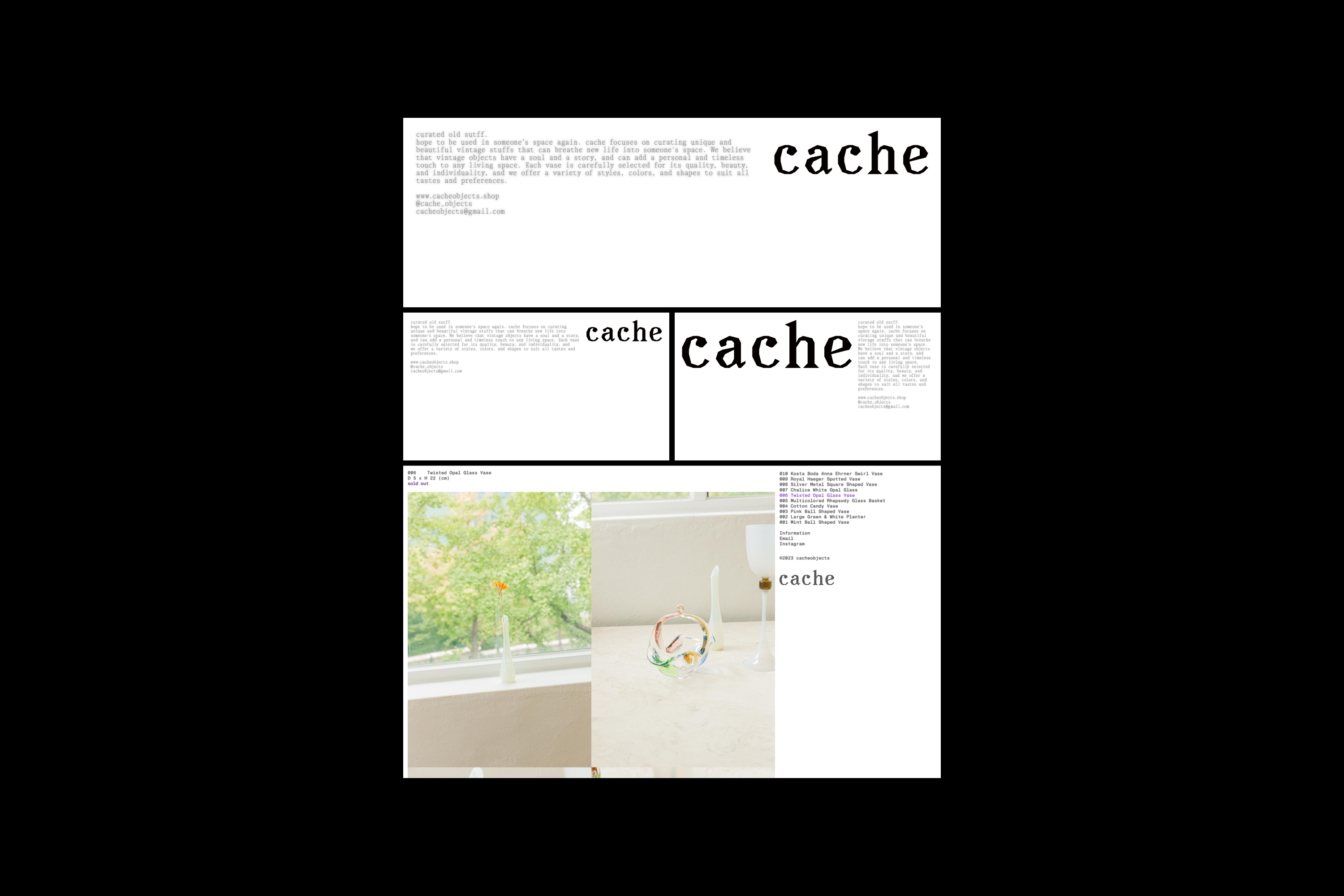
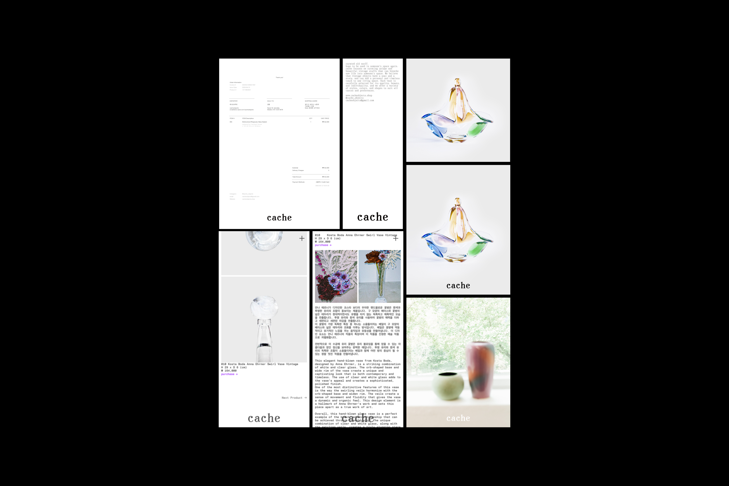
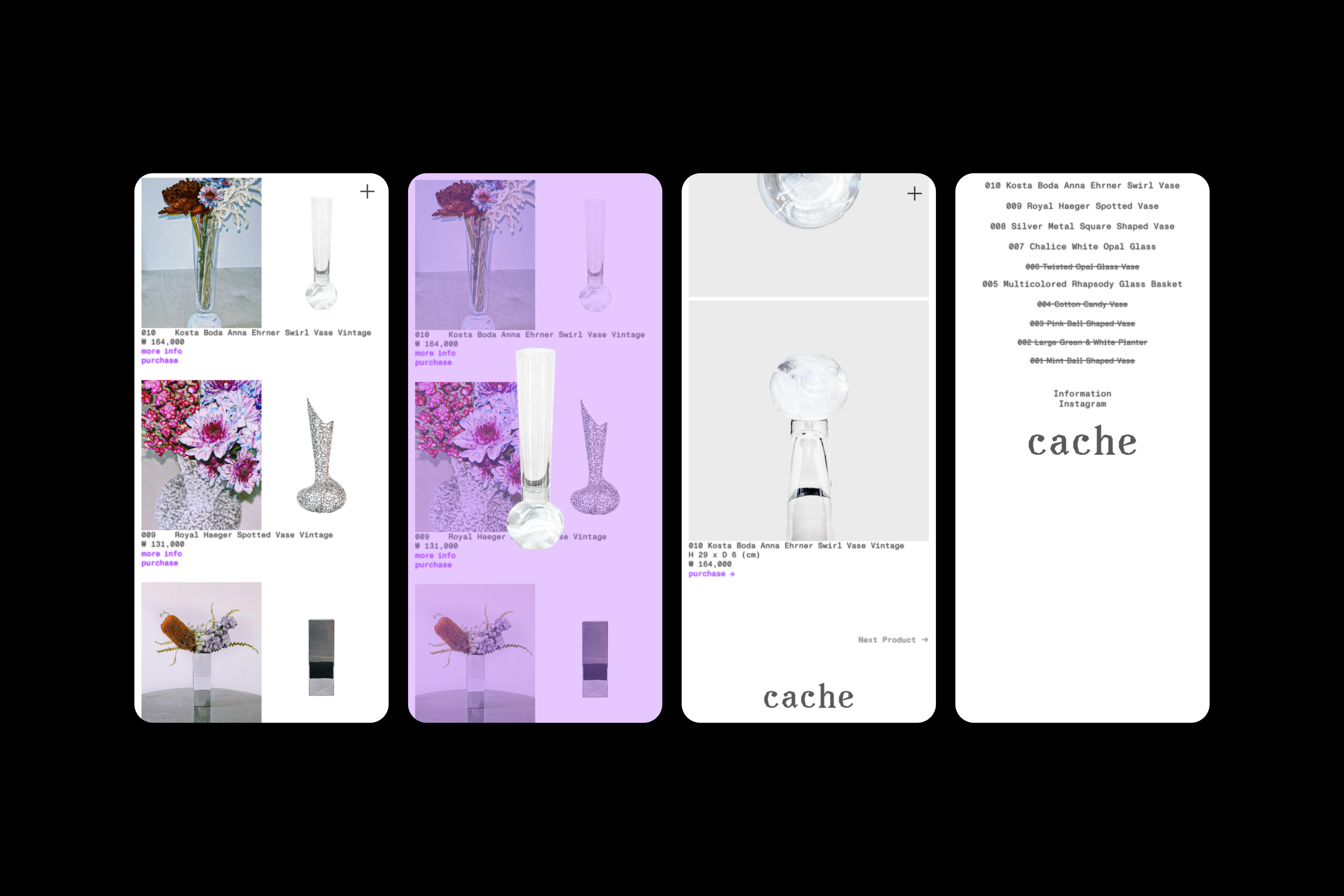
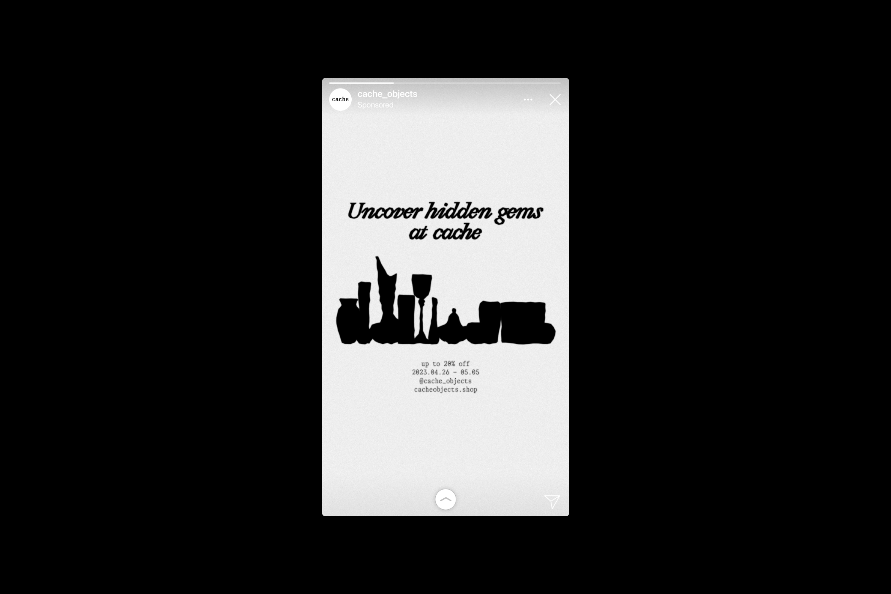
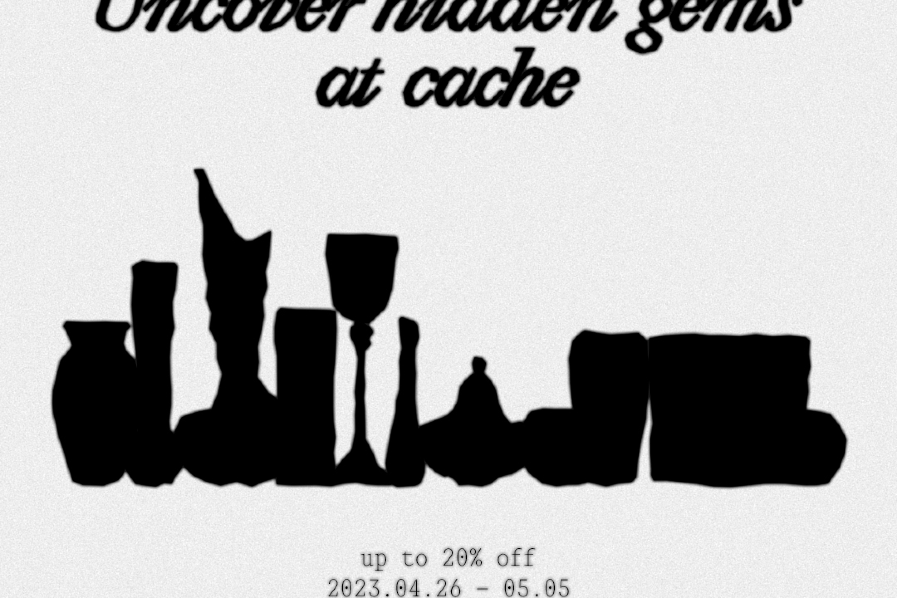
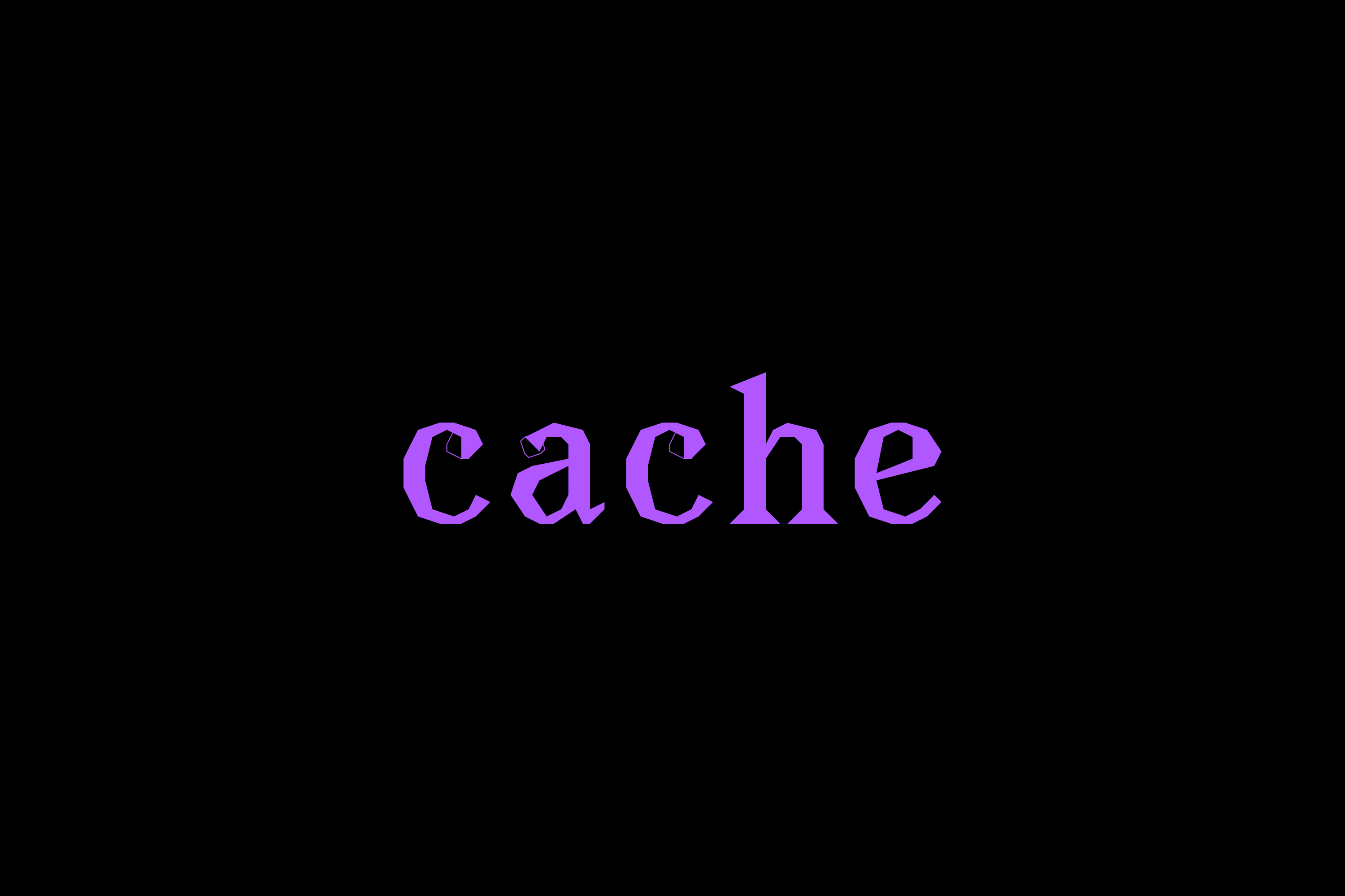
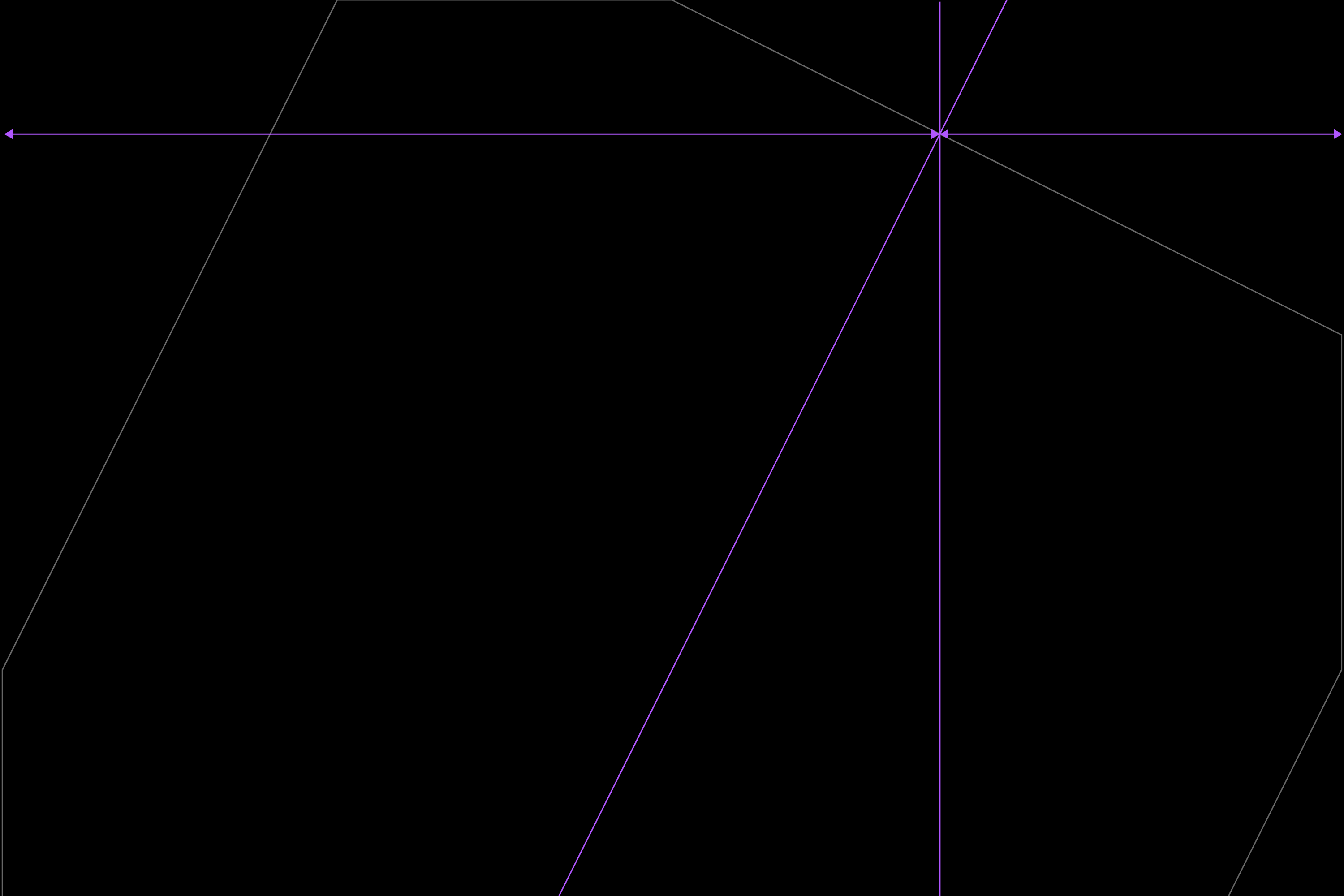
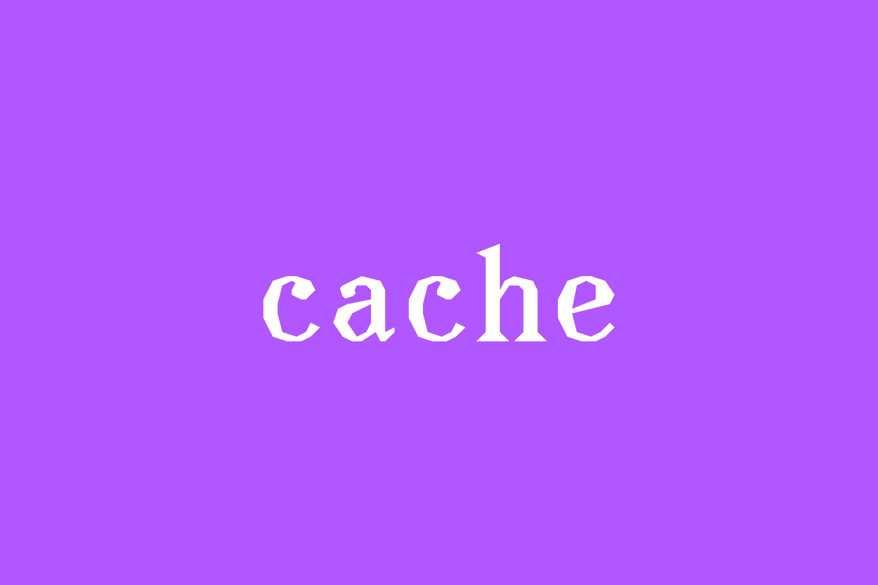
Cache Objects drew inspiration from the shared qualities between the internet term “cache” and vintage objects to shape its brand identity. On the internet, a cache stores data temporarily for quick access and reuse. Likewise, vintage items preserve stories and experiences from the past, brought back to life in a new context.
Building on these parallels, Cache developed a visual identity that captures a sense of memory and emotional resonance. The logo design uses a small font size and blurred text to express the fading yet persistent connection between past and present. This subtle visual treatment reinforces the brand’s unique character and enhances its recognizability.
Cache Objects, 2023, Categories : Brand Identity, Graphic Identity, Logo, Website, Poster, Card, Package
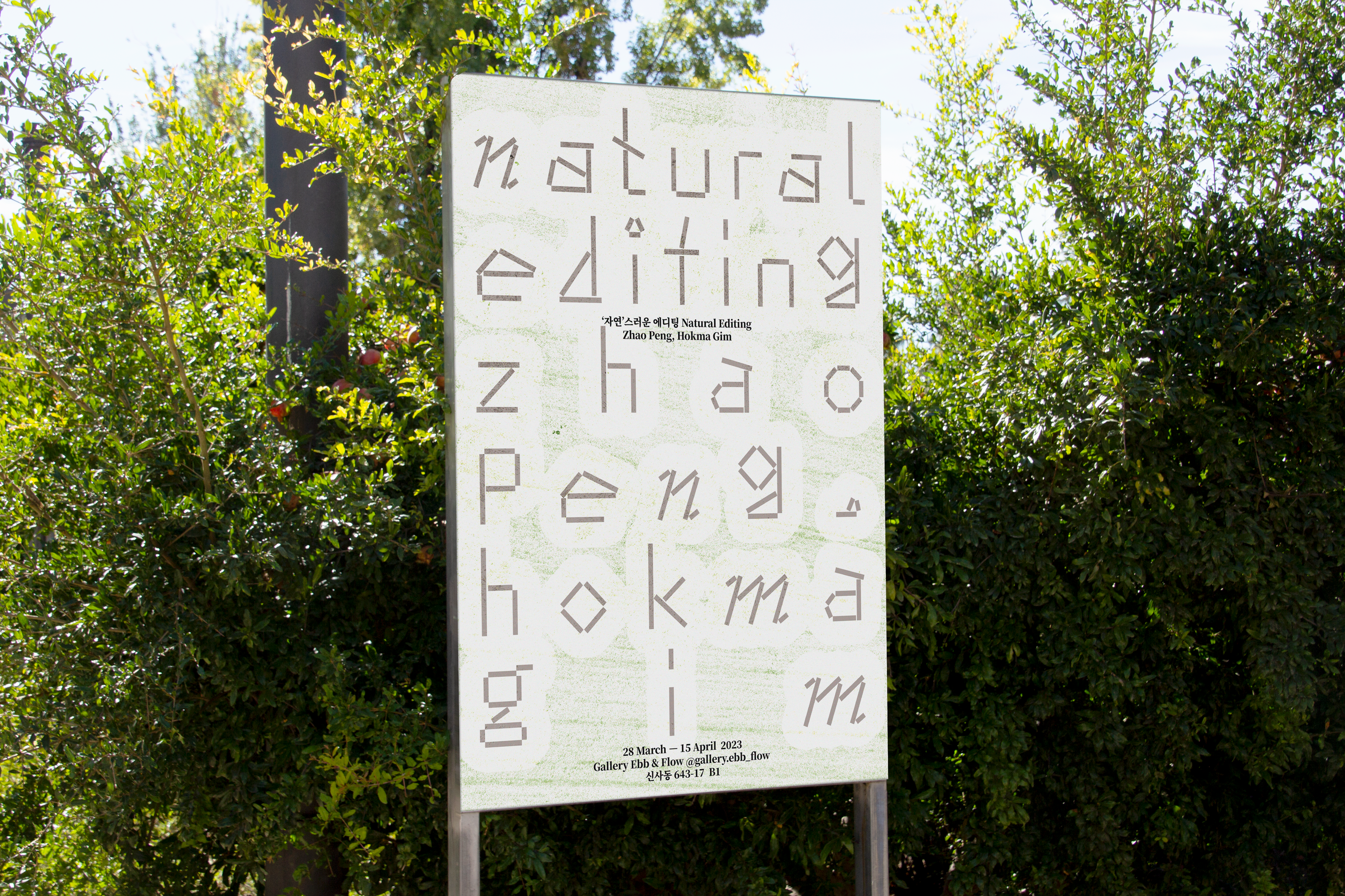
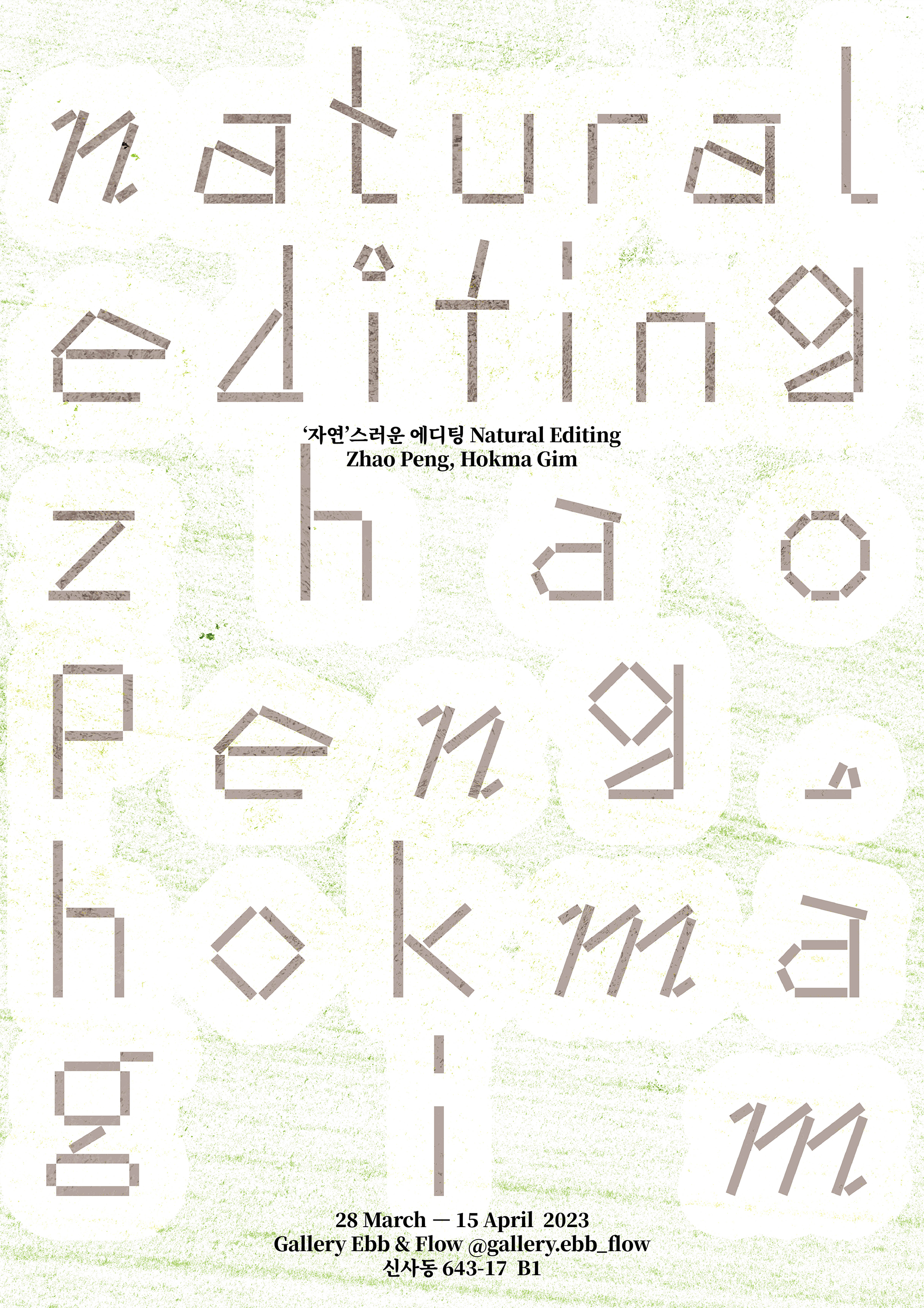
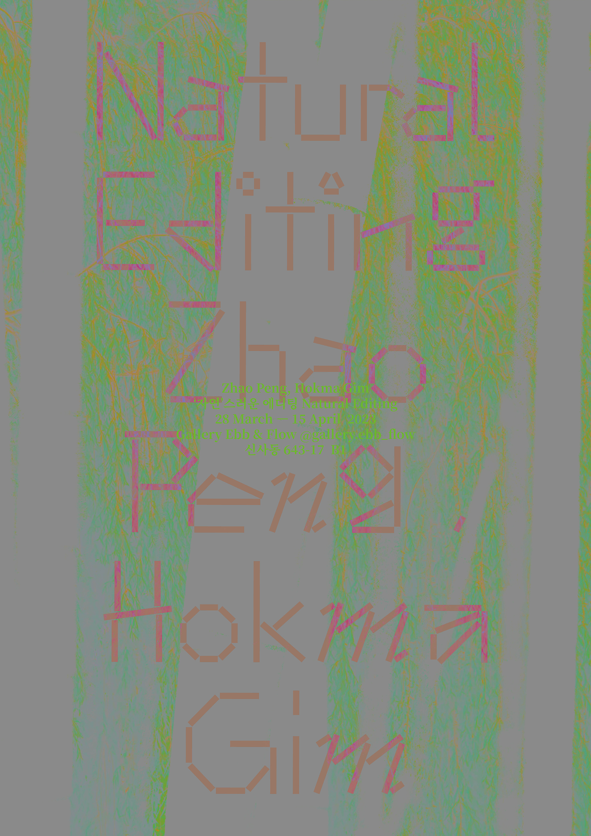
Exhibition poster design for an exhibition of works inspired by bamboo and willow trees, under the title of "Natural Editing", which has a dual meaning. The artists don't just draw nature, they reorganize it, giving it meaning and new values.
The exhibition poster uses a typeface that is reminiscent of the artist's motifs, but not at all natural, to question the idea of naturalness.
Natural Editing, 2023, Category : Poster
The exhibition poster uses a typeface that is reminiscent of the artist's motifs, but not at all natural, to question the idea of naturalness.
Natural Editing, 2023, Category : Poster
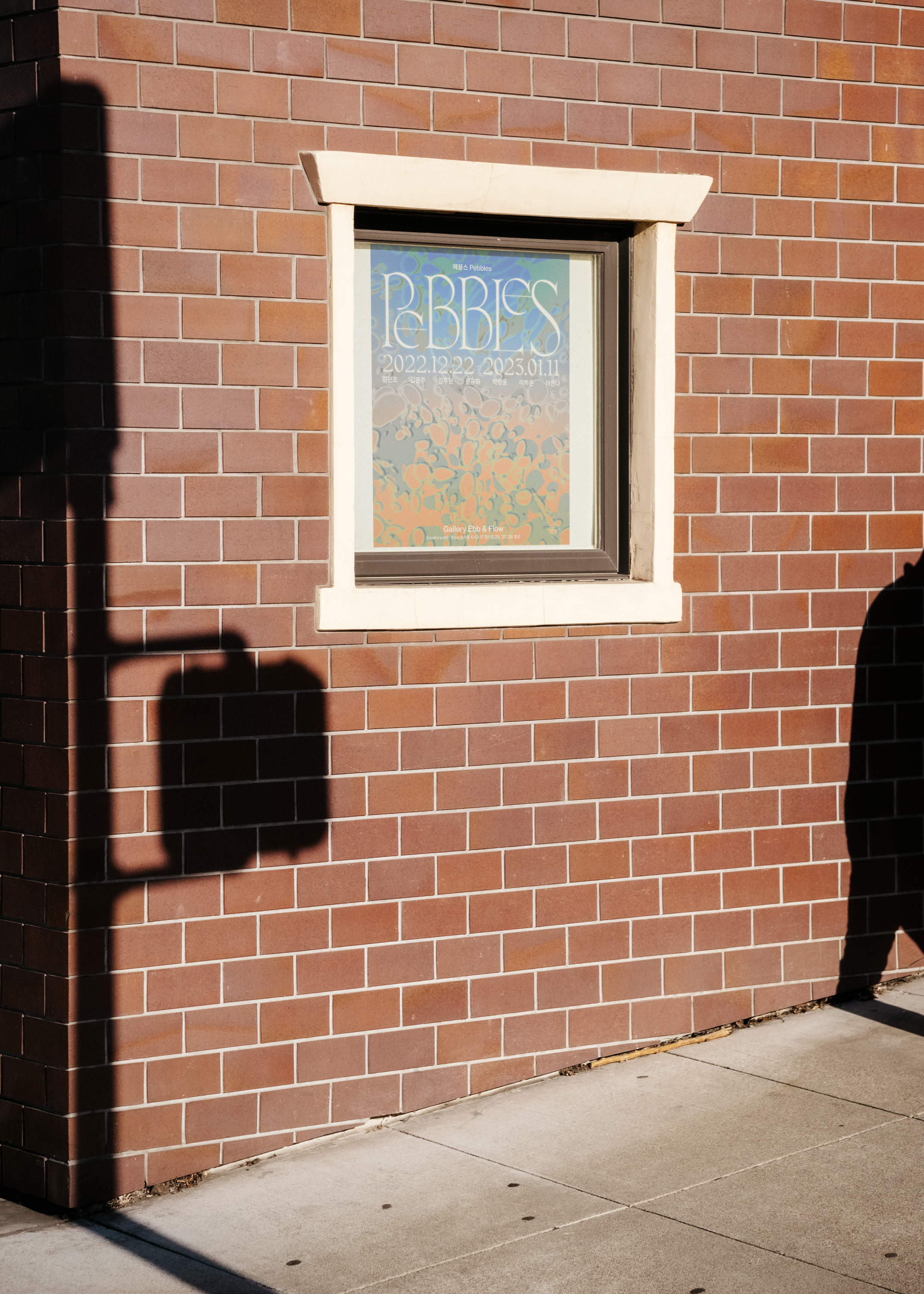
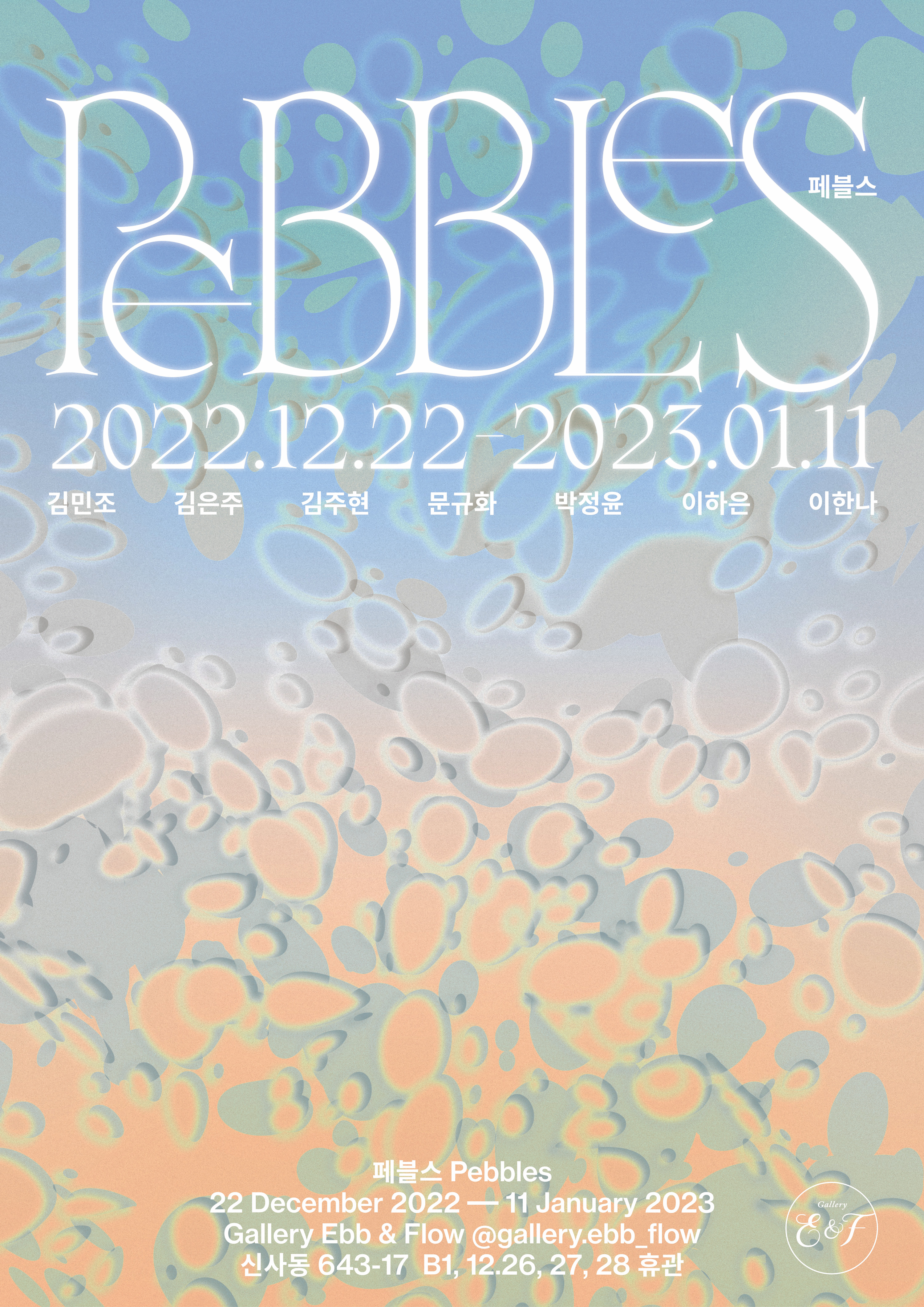


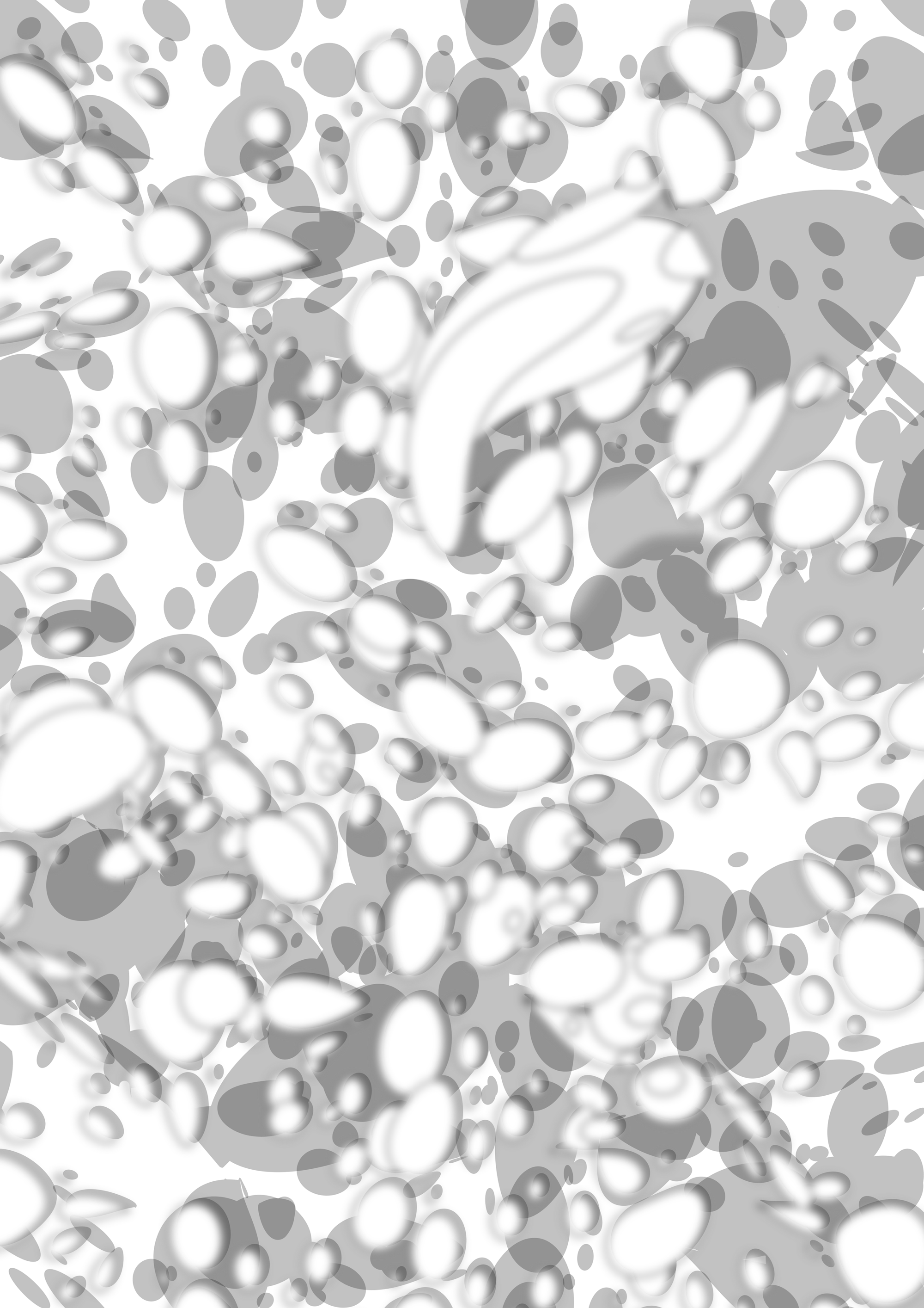
A poster design for Gallery Ebb and Flow(@gallery.ebb_flow)'s exhibition Pebbles. Pebbles are worn smooth and small by the ebb and flow of the tide, an exhibition conceived from the usual experience of picking up pebbles from the beach and storing them preciously.
The poster's graphic is also a bubble created by the ebb and flow on the beach, and it also means pebbles that have become smooth in this bubble.
The title graphic is showing sculptures that have not yet become smooth, and conveying new possibilities with a blurred background that seems to be submerged. The exhibition, which consists of 7 young artists' artworks, brings together pebbles with traces of ebb and flow of time and experience.
Pebbles, 2022, Category : Poster
Pebbles, 2022, Category : Poster